
As companies grow and mature, there comes a time to rethink and restructure the brand, as a way to stay relevant to current customer needs and market dynamics, to bring clarity and structure to employees.
The Take-Off
MOTO-PFOHE is one of the first car dealerships in Bulgaria, established in 1991. It is a market leader and the official dealer of Ford, Volvo, Jaguar and Land Rover in the country. For 30 years, the Moto-Pfohe group has evolved to bring multi-layered excellent service to every car driver in Bulgaria, providing sales and service for new and used cars, insurance and financing services, car rentals, spare parts and accessories.
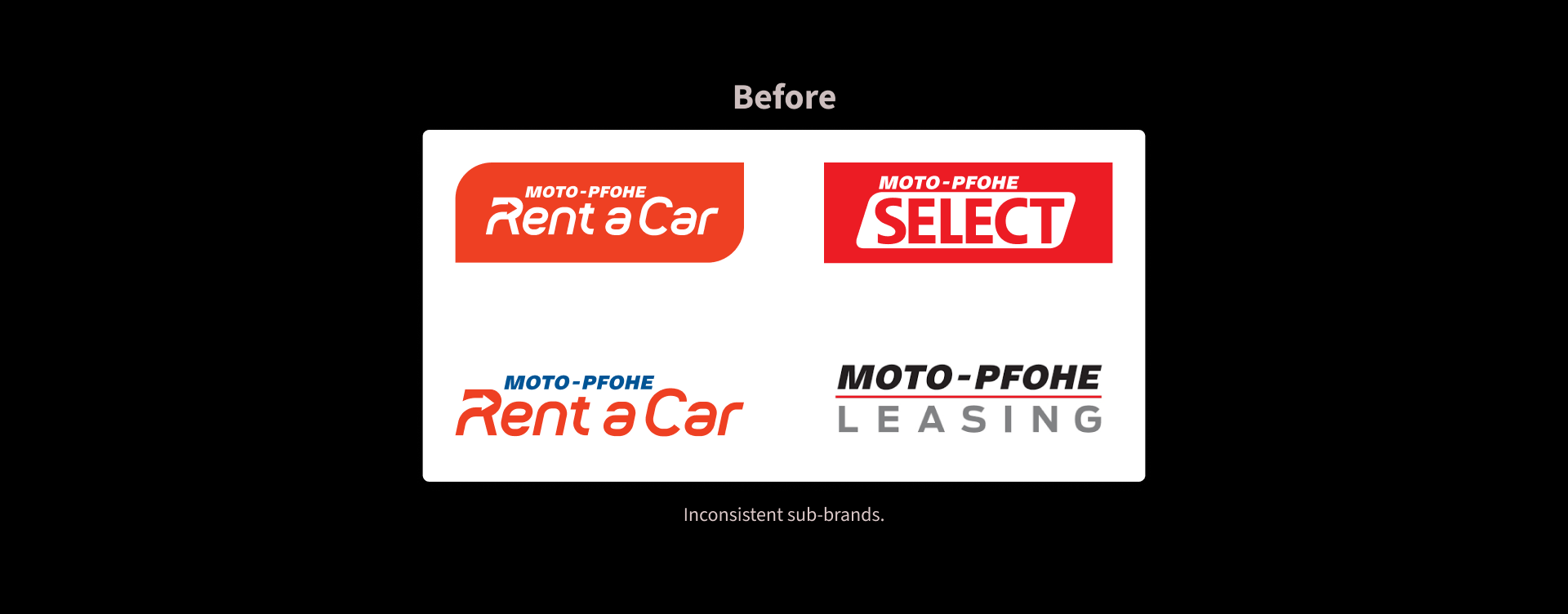
To aid customers further into using the full potential of Moto-Pfohe, they started developing a mobile app in 2021. Bringing all services together proved difficult and messy, as each was developed at a different time in the history of the company and had its own logo and website. It was clear that before launching the app, the team needed to combat the visual dissonance across the portfolio. We were selected to bring order and structure to the portfolio that would make way to a meaningful, user-centric experience online.
The Journey
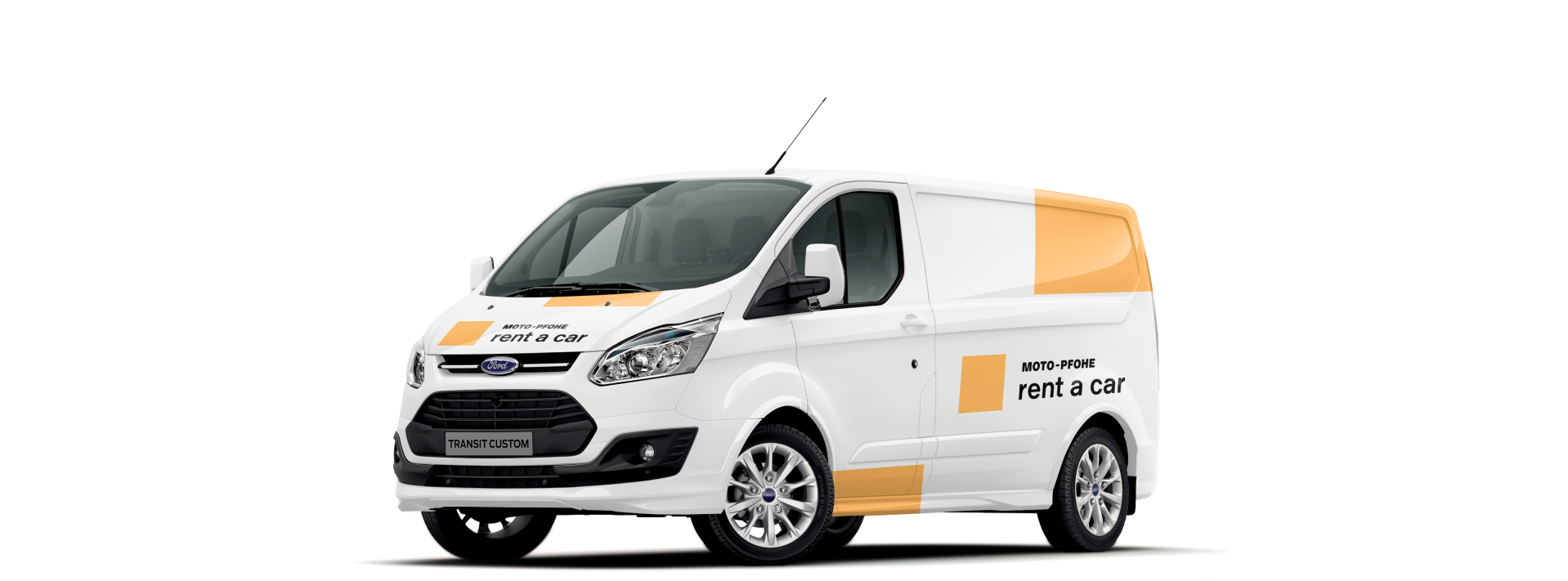
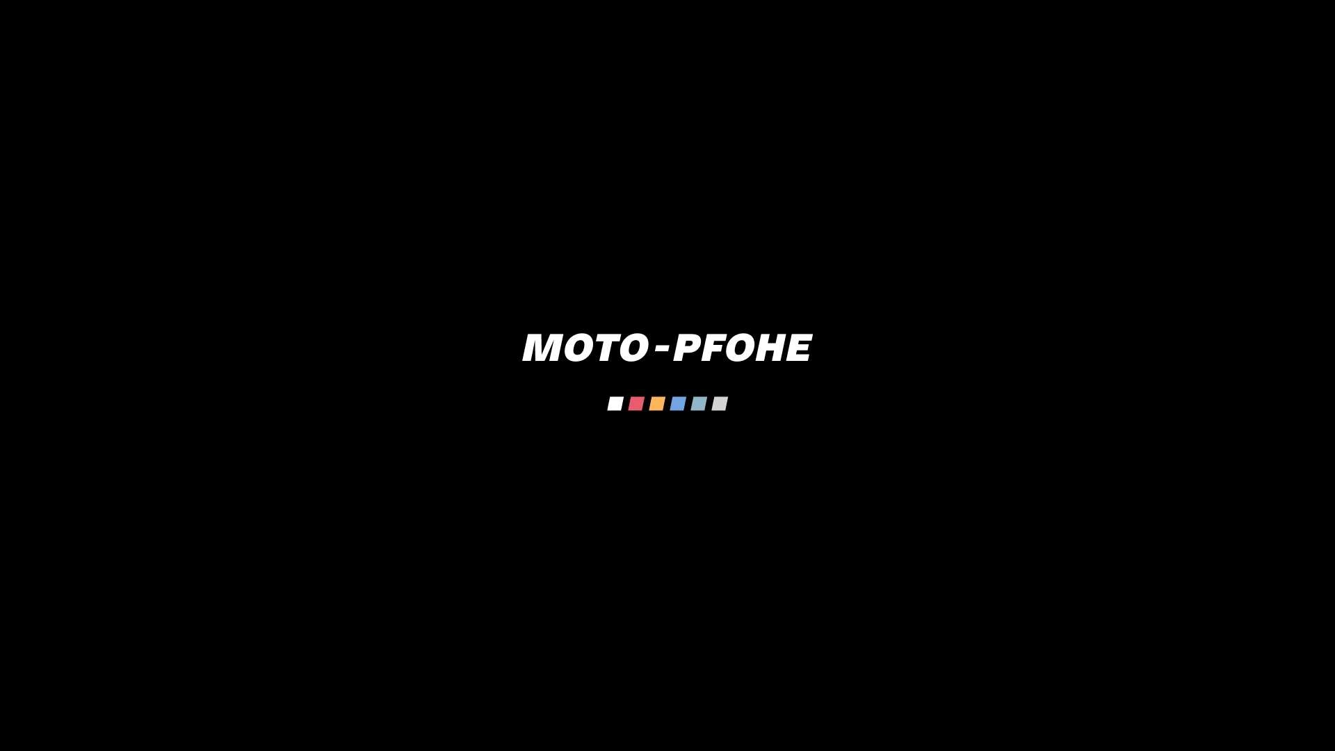
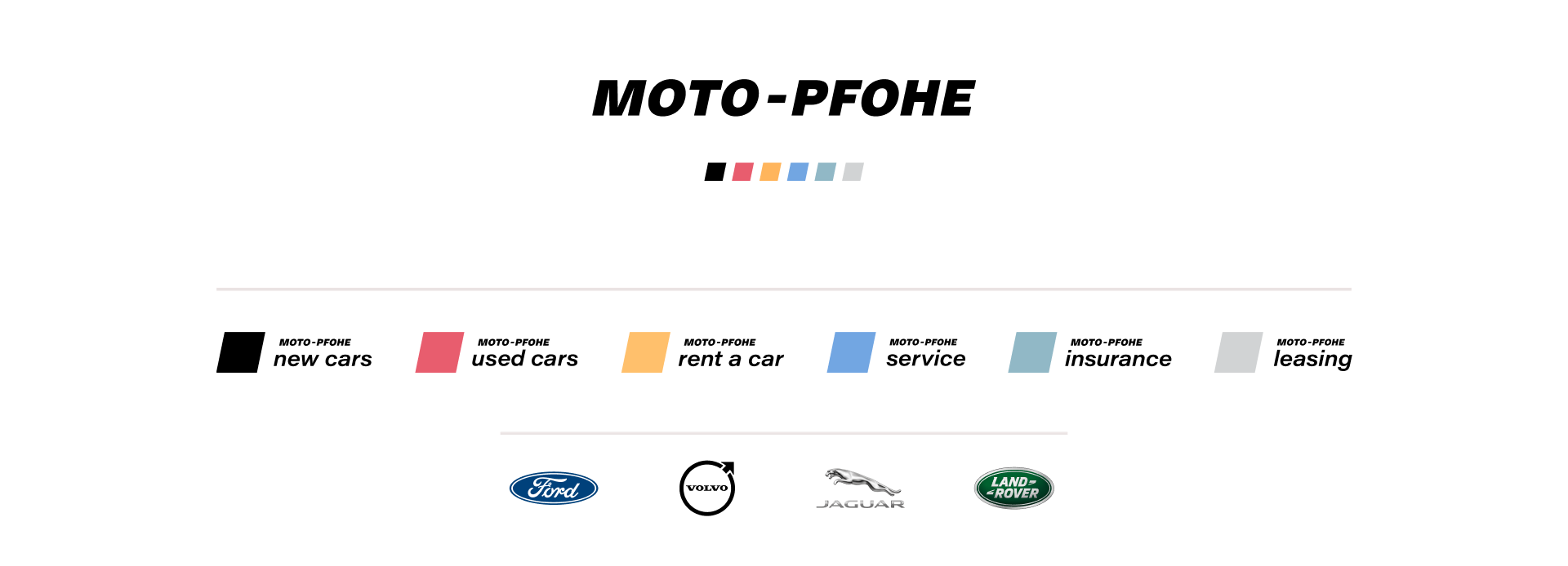
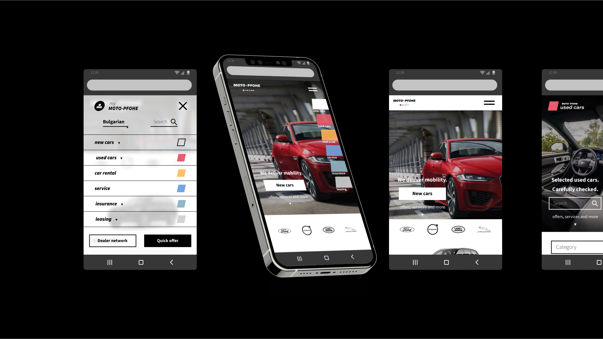
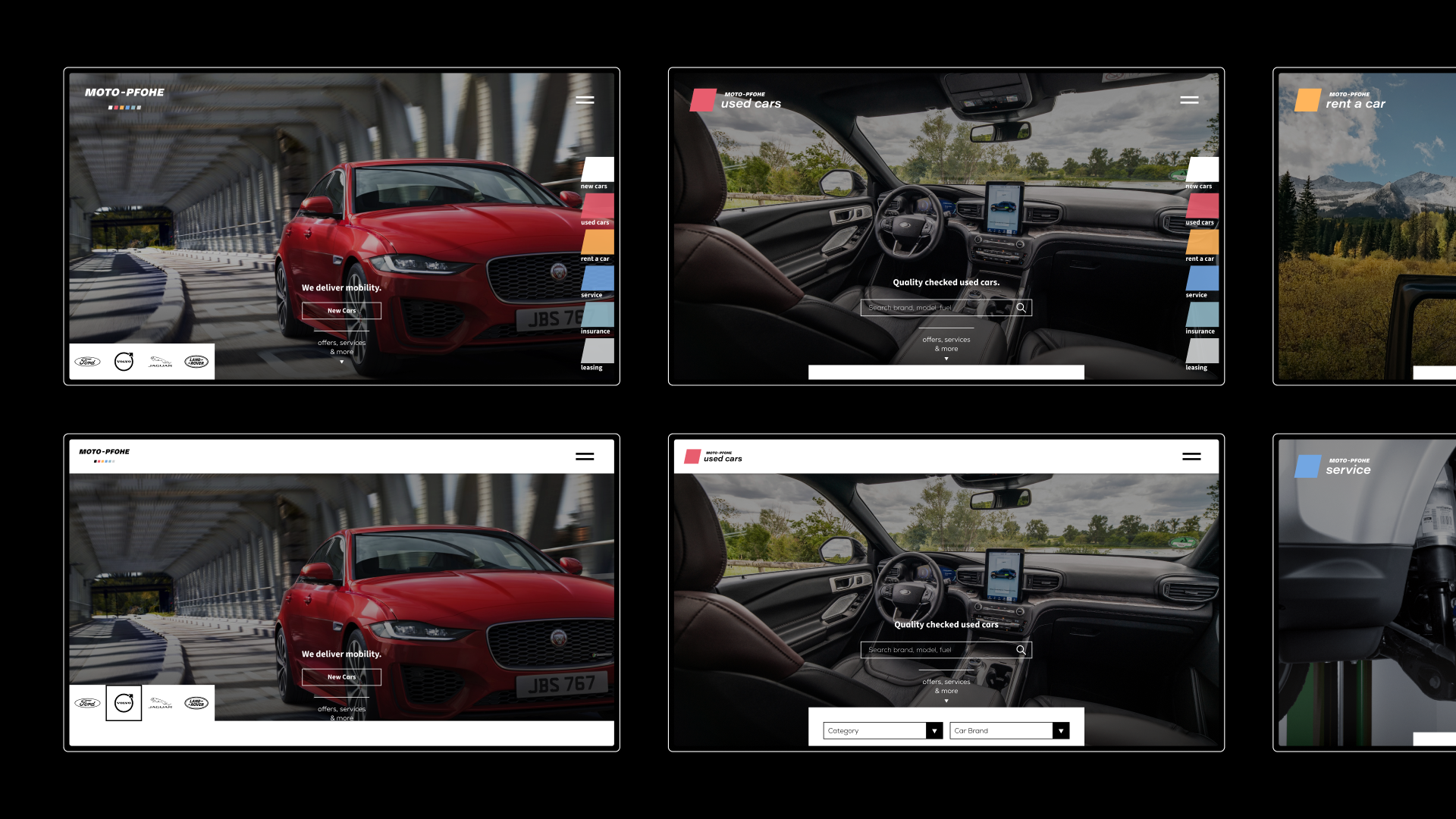
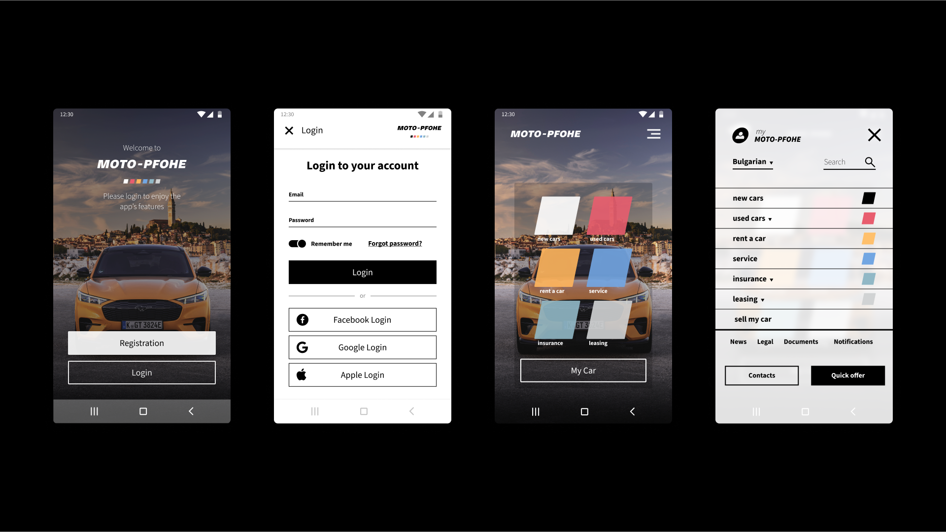
We organized the portfolio into a logo family, placing all services under the mother brand. Taking inspiration from the incline of the original logotype, we emphasized the dynamic nature of the brand by setting up a system of 6 colored tiles for each sub-brand, ranging from bold, warm to cold, conservative tones. By showing all colors under the brand name, we moved Moto Pfohe perceptions from an auto dealer to a full spectrum car service provider, bringing forward a sense of scope, stability and accessibility.
Slide left/right to view color/negative:
To break away from the established tradition in the automotive segment - stiff corporate look and information clutter - and to focus on user experience, we followed three guiding principles:
+ simple structure
+ intuitive navigation
+ sensual stimulation
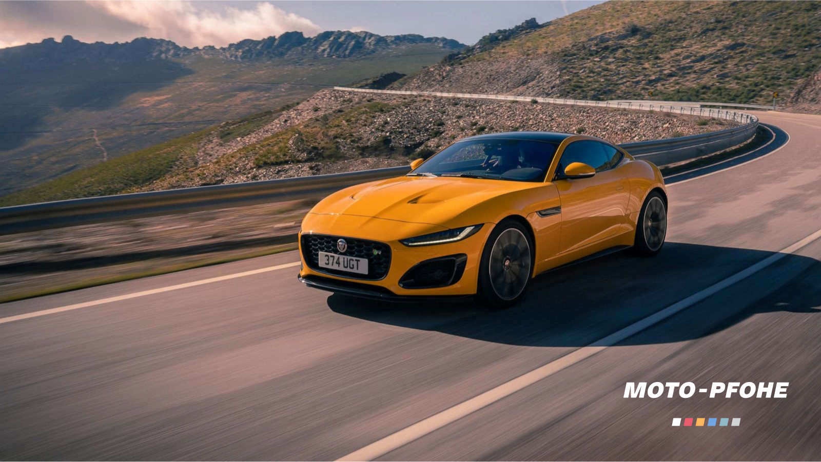
and adopted them each step of the way through redesigning the concept for the corporate website, all service websites and the mobile app. We relied heavily on sexy automotive imagery and minimalistic UI.
The Resolution
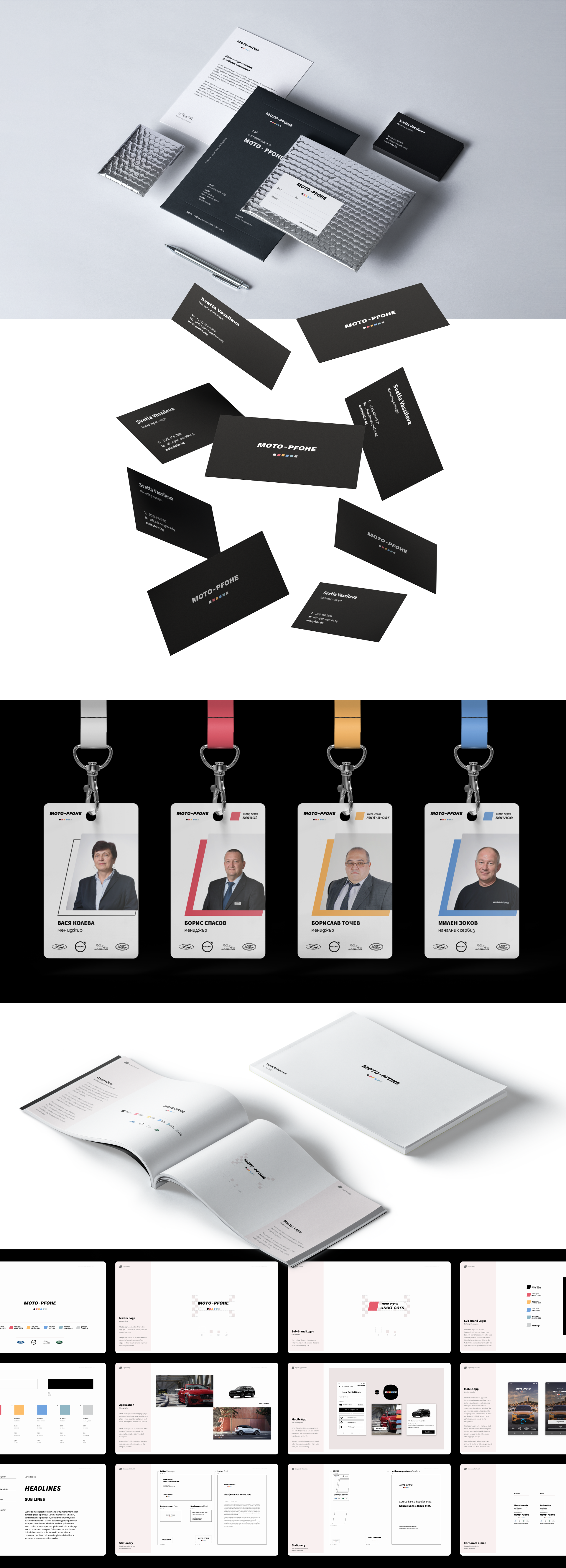
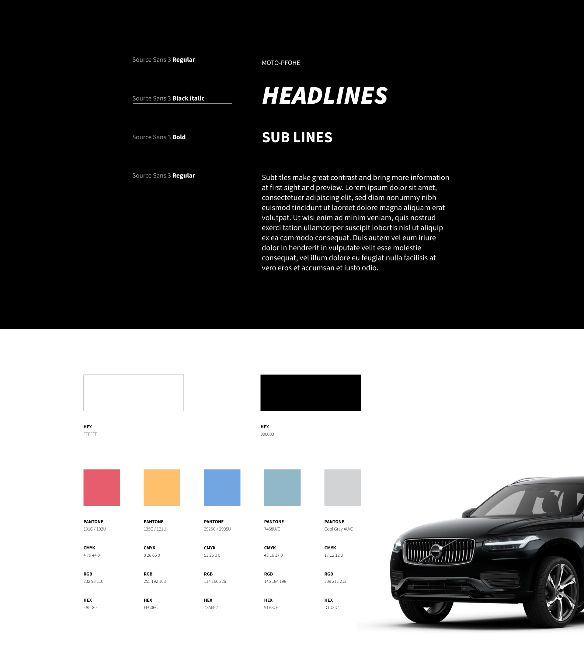
For consistent adoption of Moto-Pfohe’s new visual language, we gathered all brand assets into a visual guidelines booklet. It has already served for the development of the app and we hope it inspires forward-thinking future designs. We are honoured we joined Moto-Pfohe on their quest to reshape their brand and customer experience.