


Ever heard of magnetic lashes? Neither had we, until recently. It’s a product currently revolutionizing the beauty market and we were lucky enough to catch the wave. Here’s how we created the up-and-coming brand LASHS’ visual identity.
The Take-Off
Based in London, the distributor planned to penetrate the Netherlands’ market and gradually grow worldwide. The client came to us with clear expectations about what the brand should convey to target customers - ladies in their 20s and 30s, passionate about beauty, fashion and luxury brands:
* quality
* durability
* a natural look
* sustainability
The Journey
The client provided visual references for packaging, overall look & feel and social media content. We were not entirely impressed with the collection, as it underestimated the full potential of what’s inside the box. So we conducted our own research and created a mood board with some top-notch cosmetic brands, haute couture fashion brands, trends in web, product design and packaging. We quickly agreed that upping the game, without losing touch with the brief requirements, would take LASHS off the shelf and into buyers’ handbags.
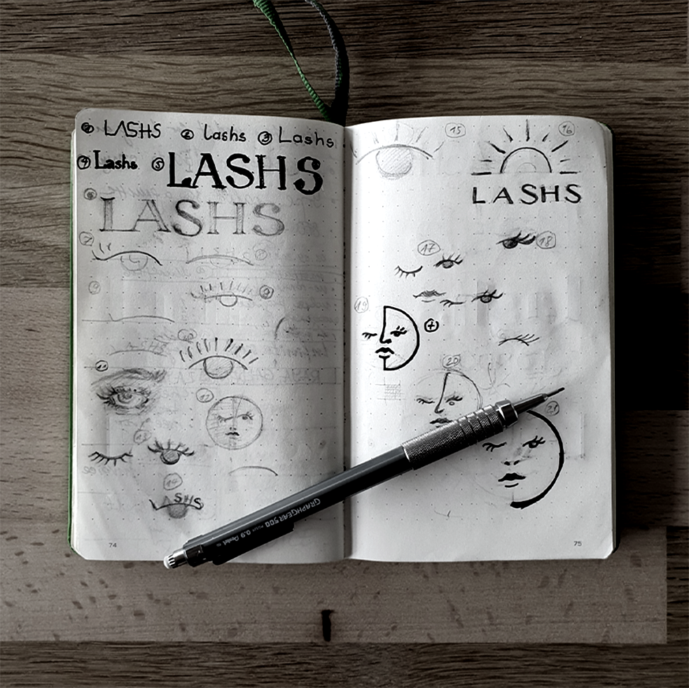
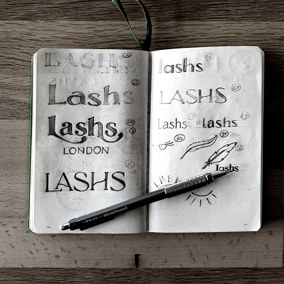
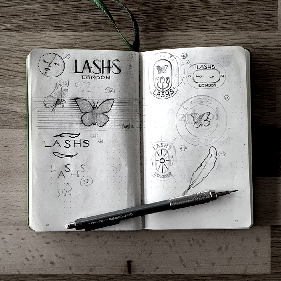
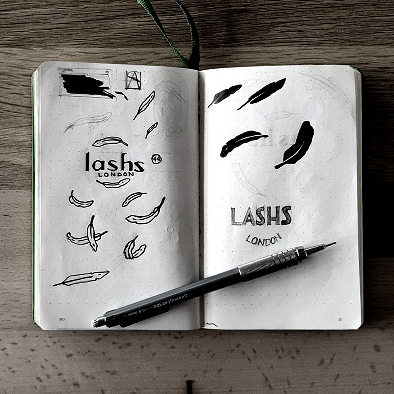
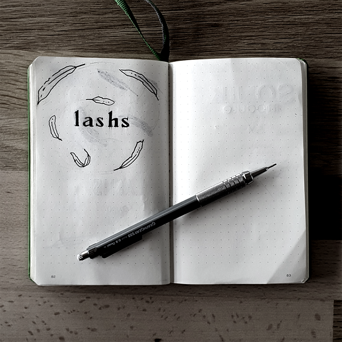
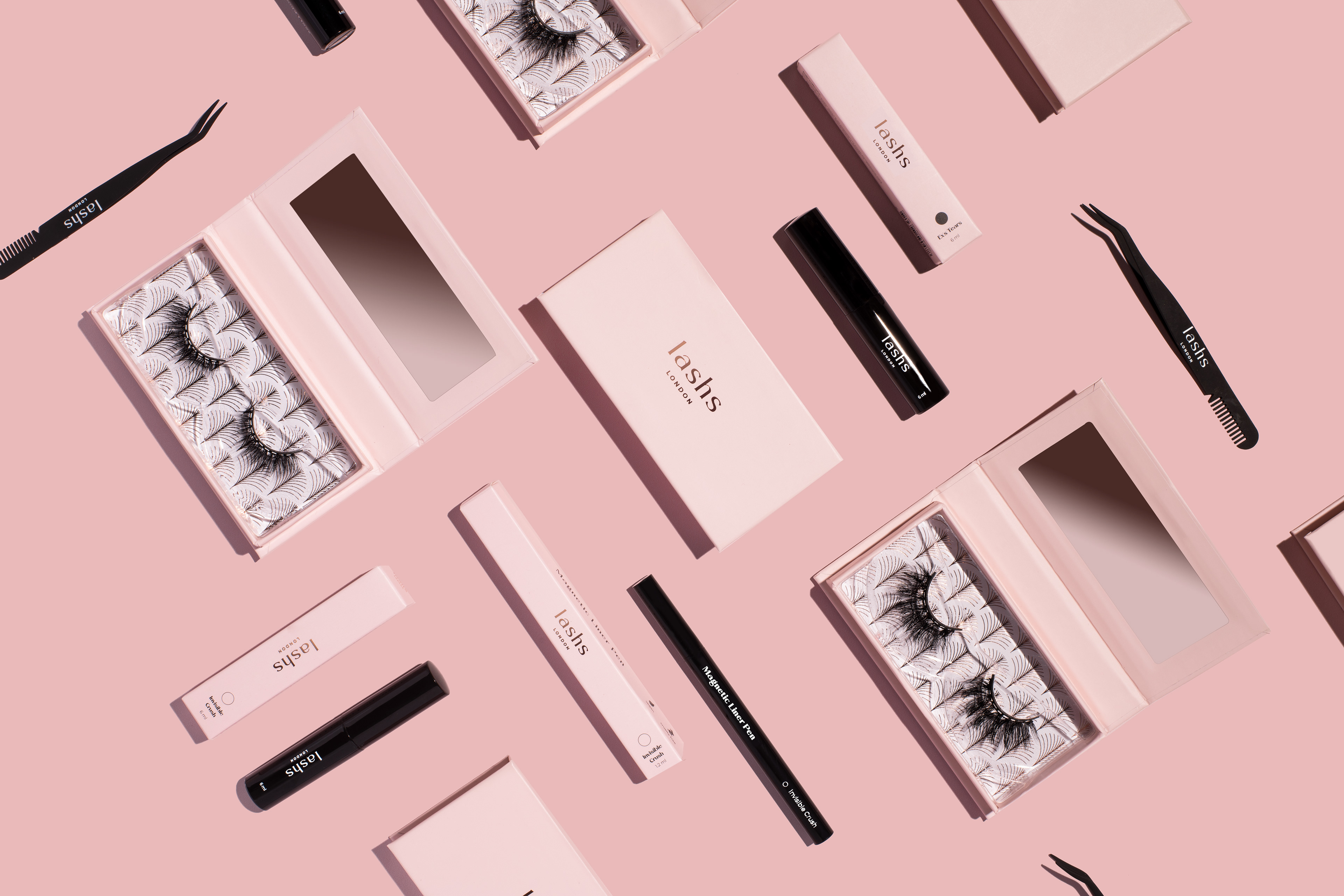
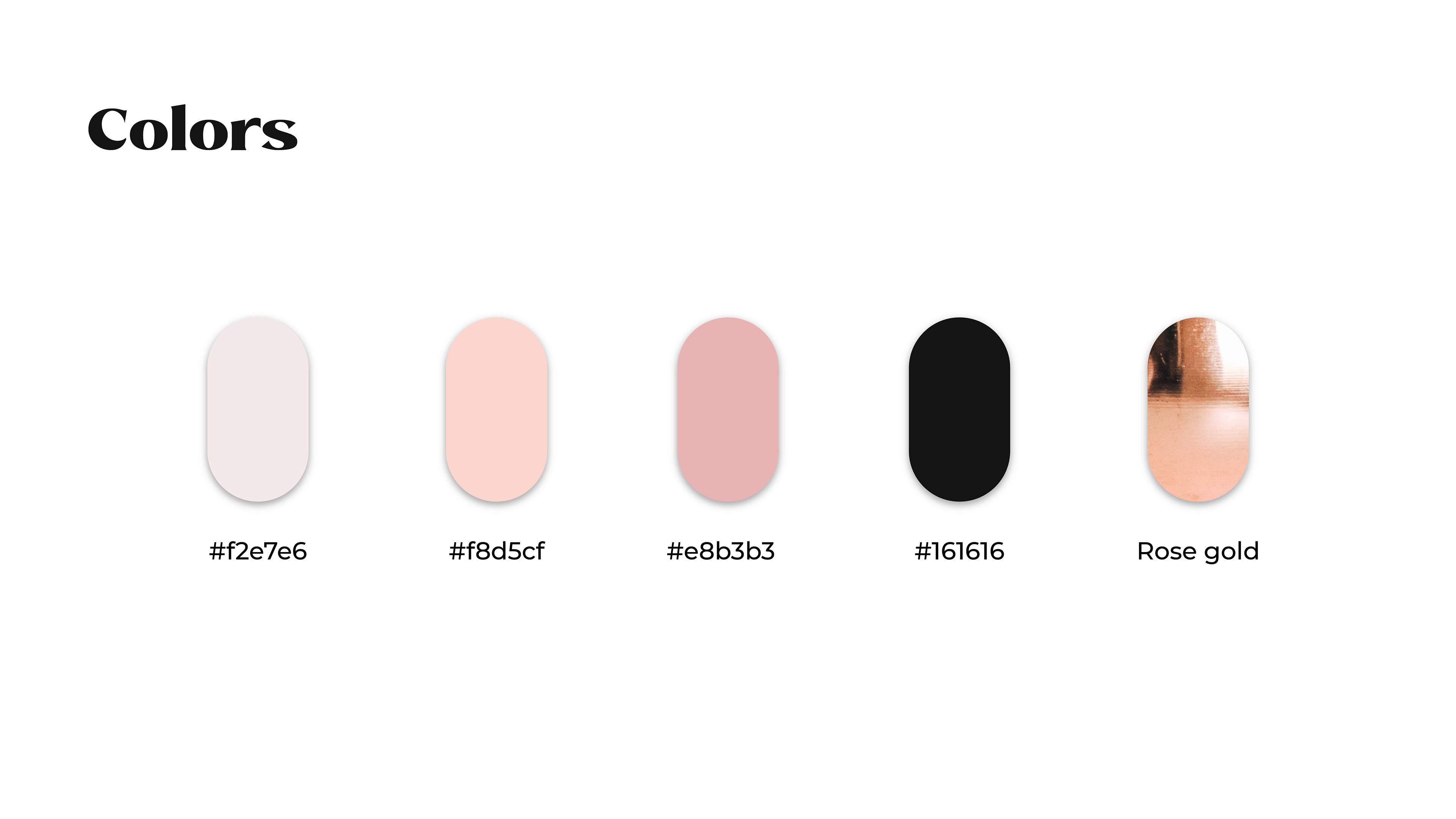
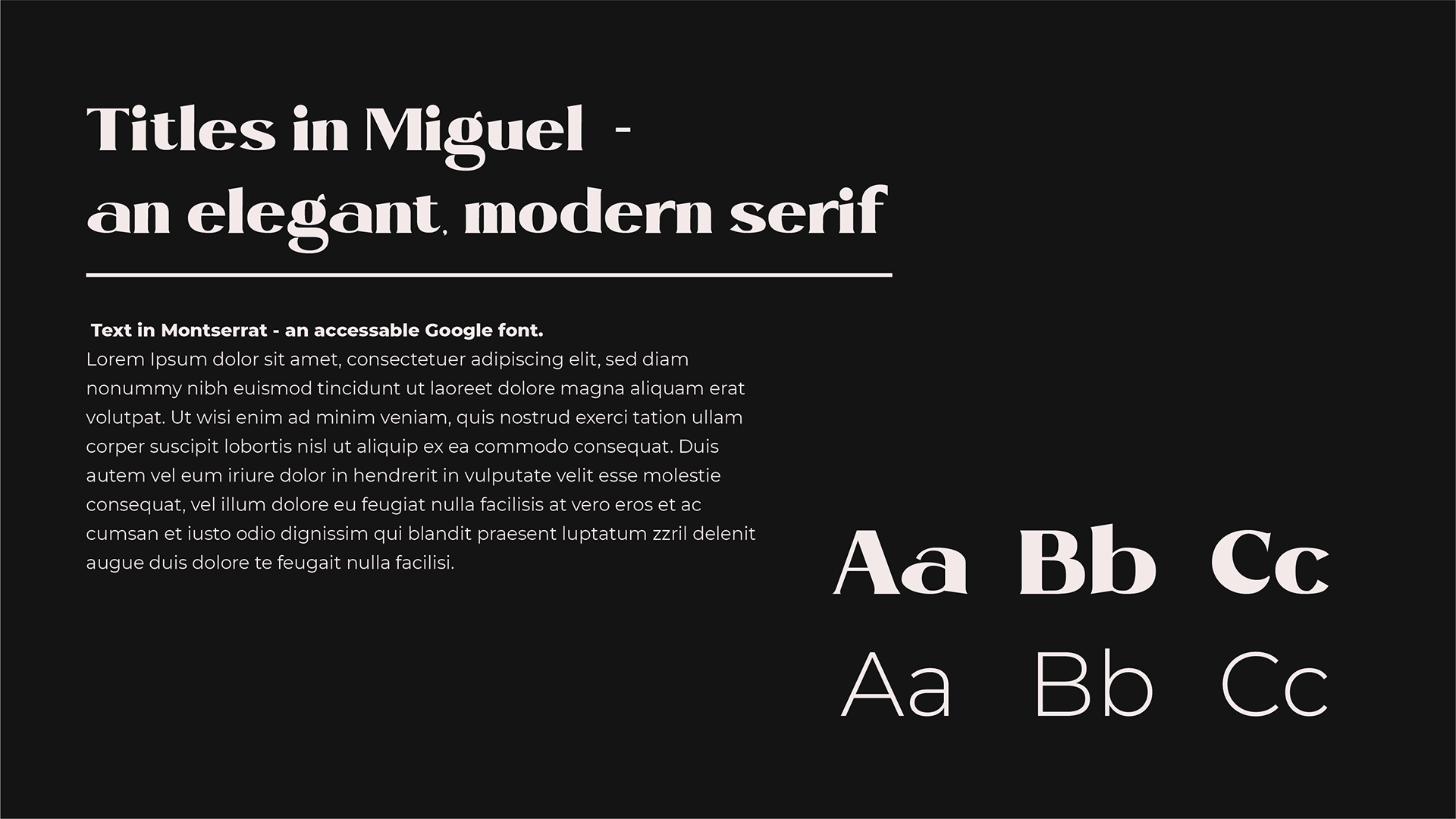
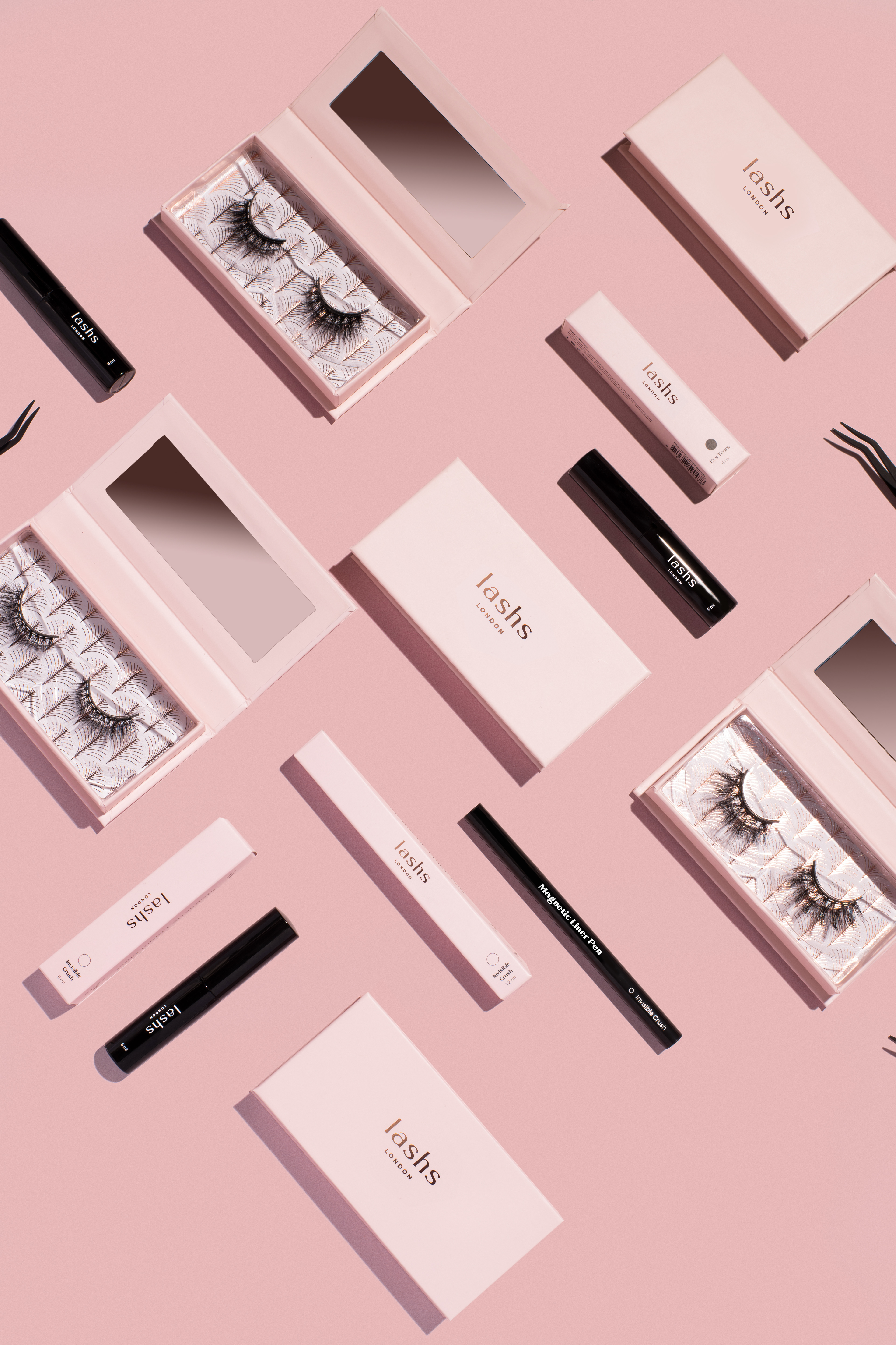
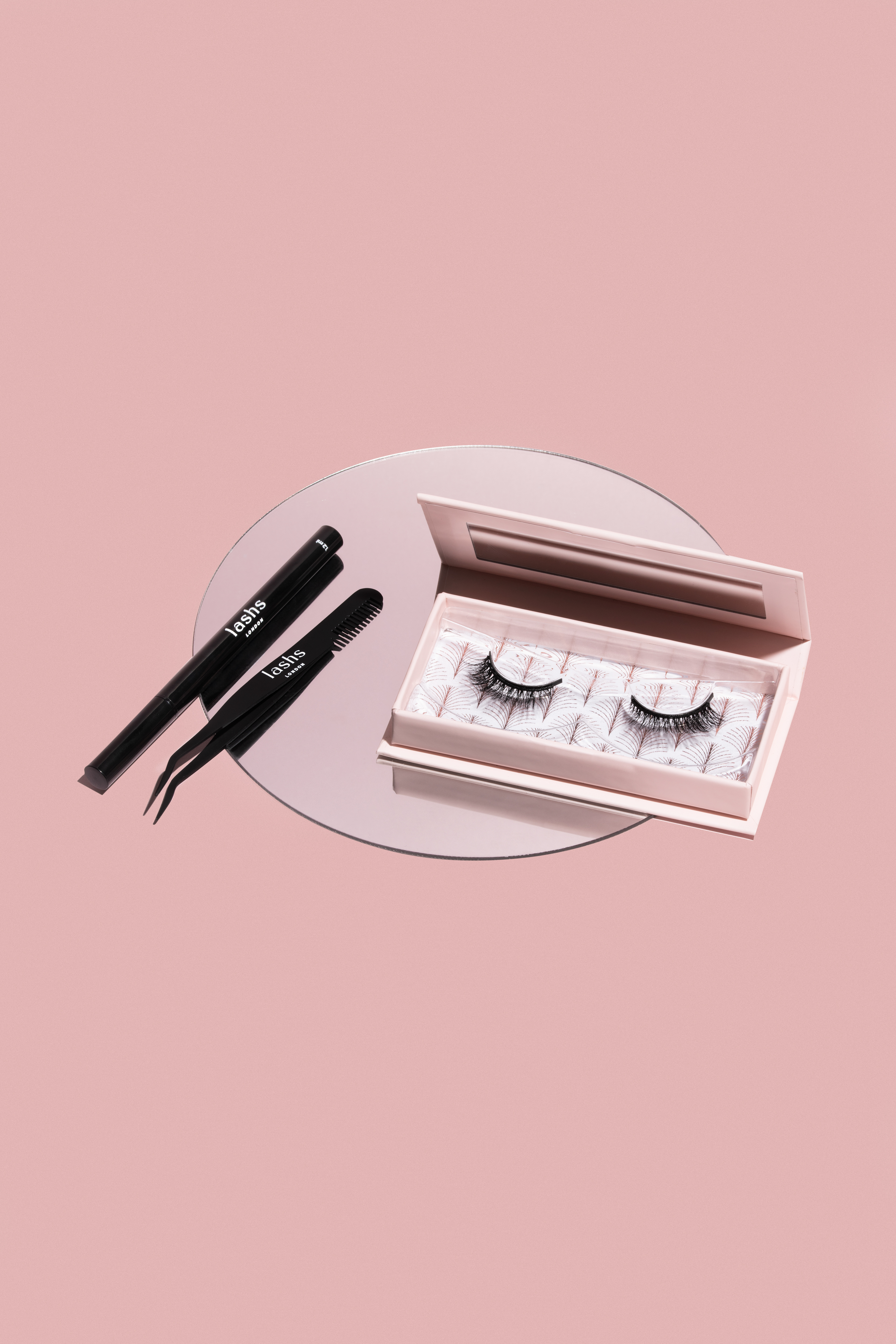
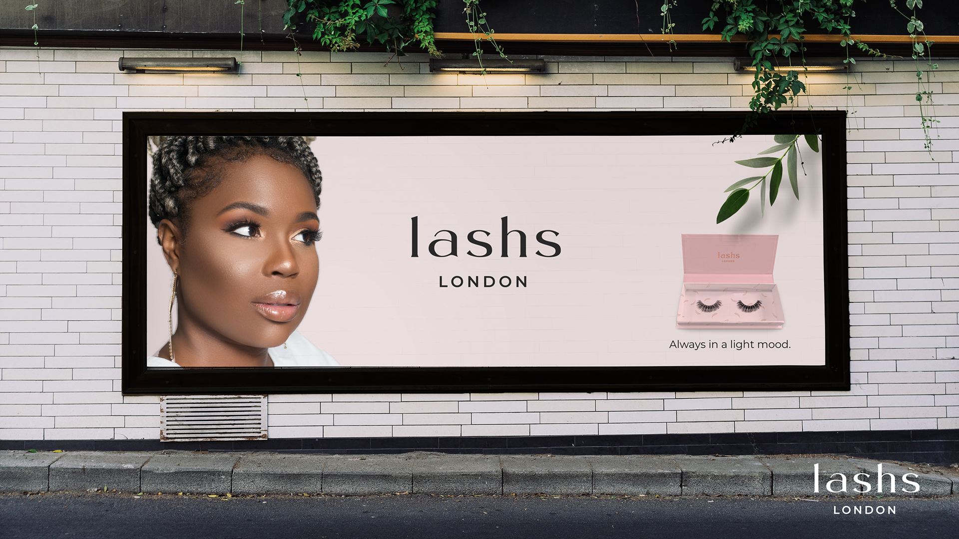
We can proudly say that the LASHS section of our sketchbooks is the most beautiful yet. To emanate quality and durability at first sight, we chose a classic typographic approach, using Miguel Bold and Regular. We cleverly added “London'' below the name to further boost brand value. Combining pearly white, pale pink, rose gold and eyelash black gave off the elegant, delicate feminine strength we aimed to grasp.
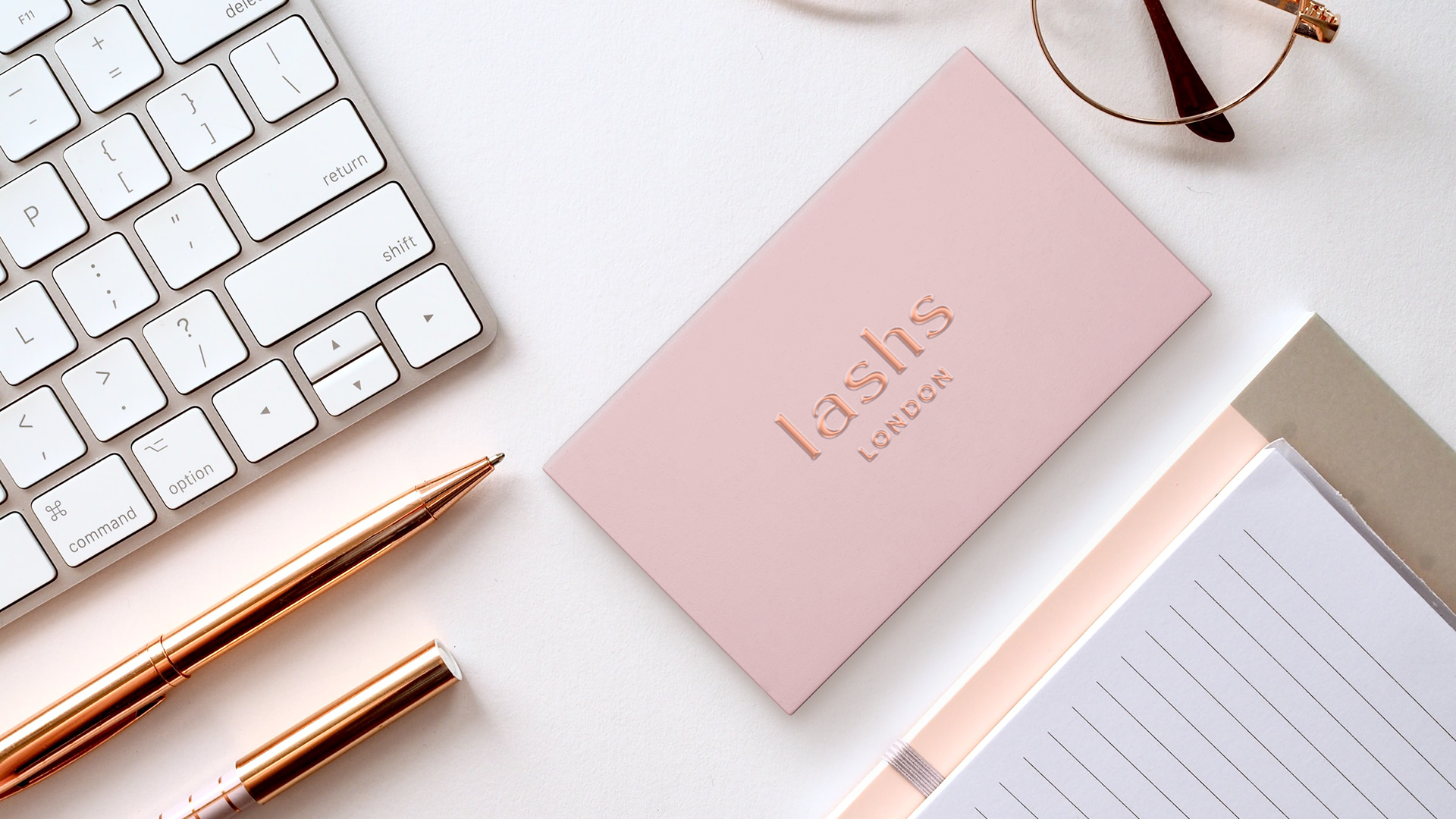


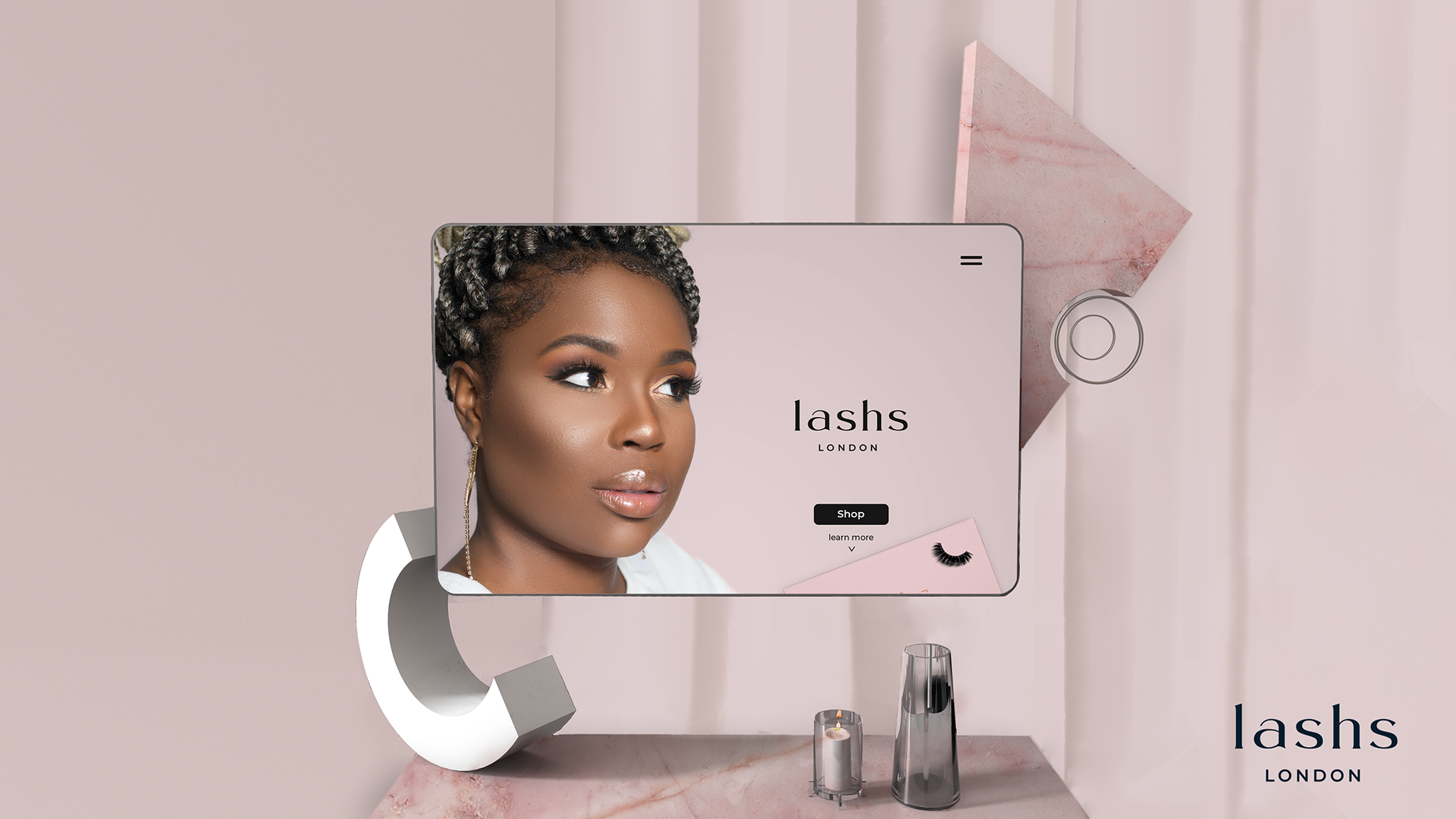
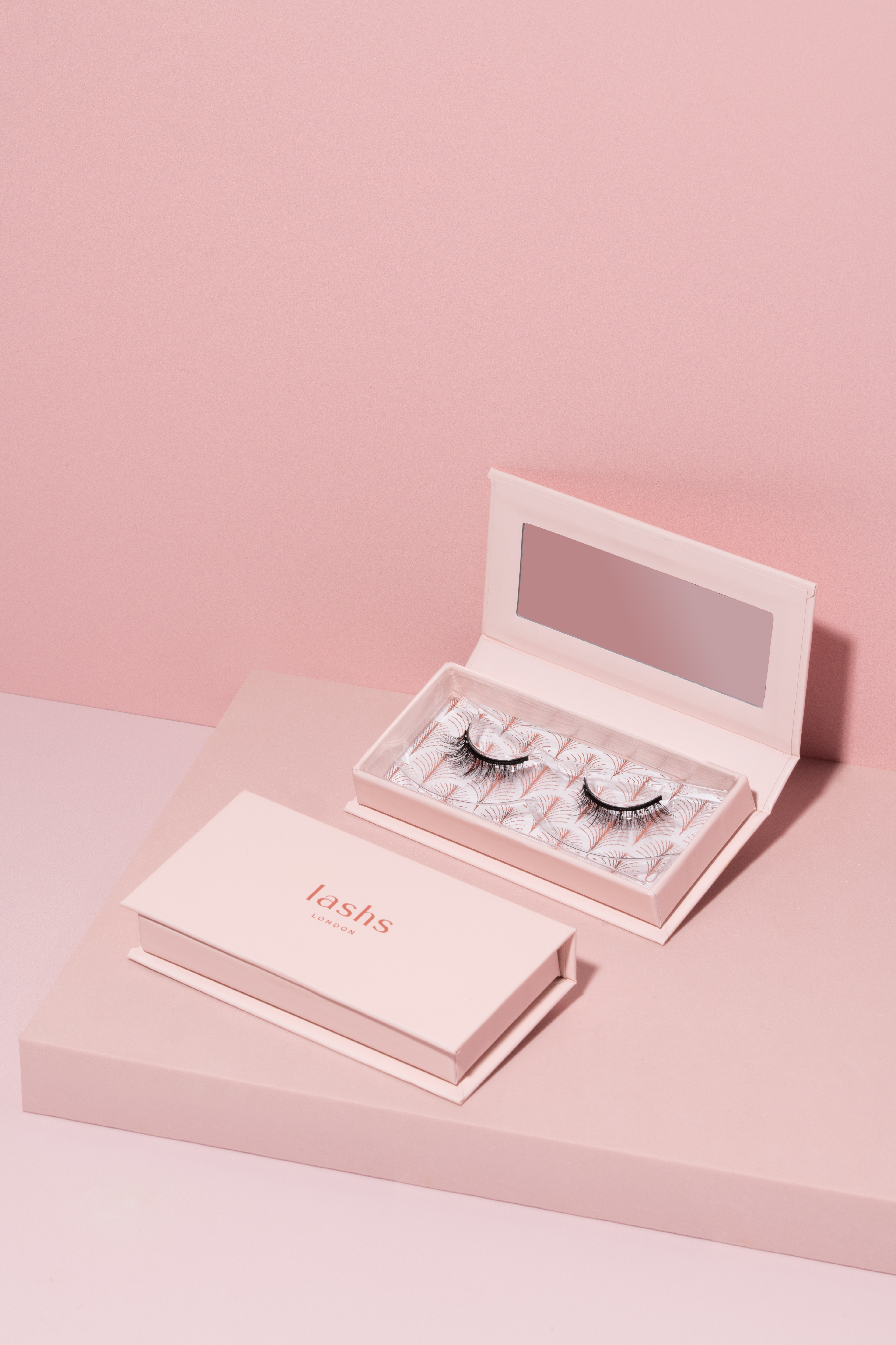
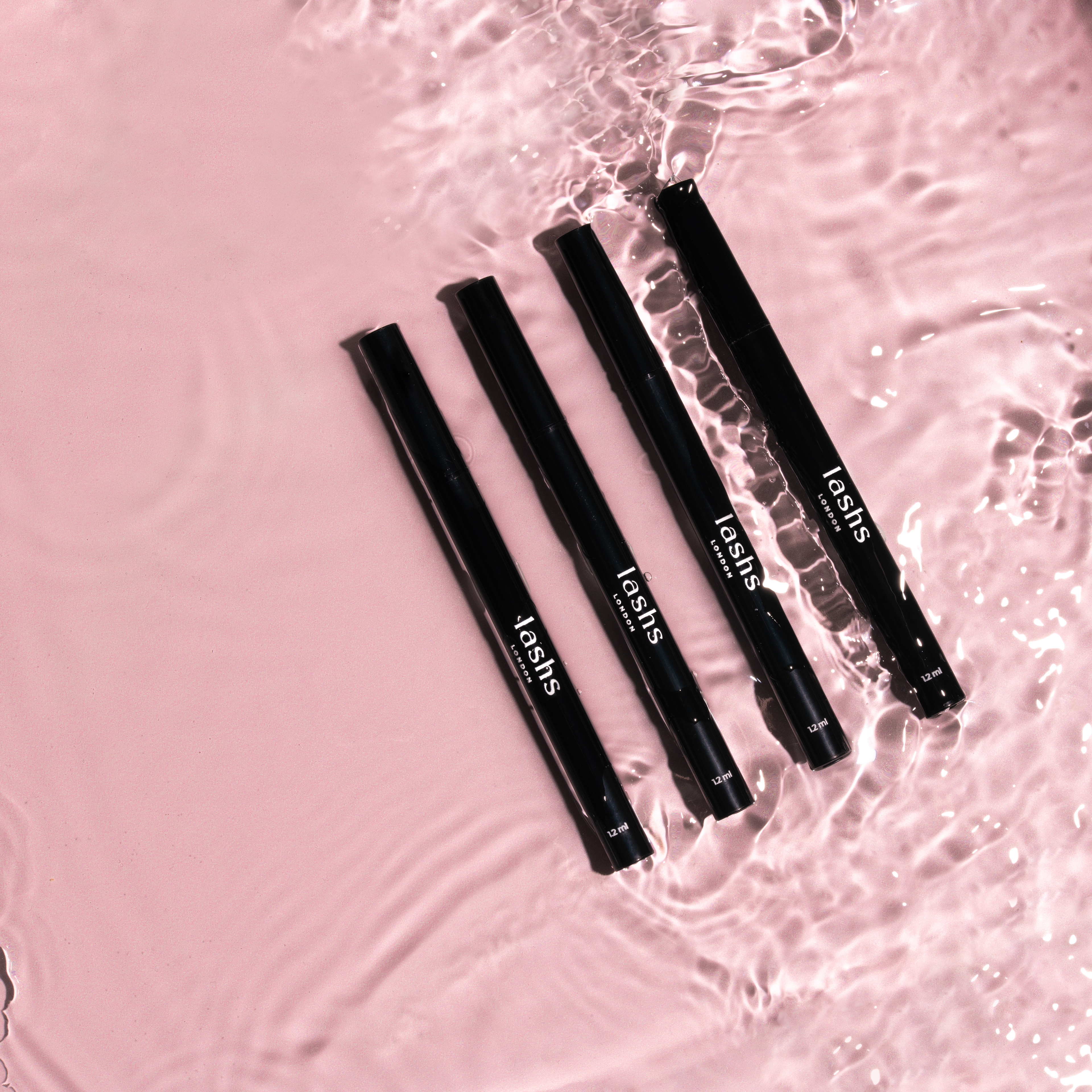
For the product packaging, we suggested an embossed logo on the outside and art-deco pattern on the inside to add an extra touch of class and sass. Surrounding the box with natural materials was our way of spicing up product photography. Further on, we developed a visual concept for digital content and ads - dynamic gifs, showing sexy, confident, natural women, with cutout close-ups drawing attention on the product.
The Resolution
LASHS is currently storming the web, turning heads far and wide. We are eagerly waiting for new product lines to add more layers of flavour, drama and glam to the goodybag.
@posoka.studio:
Vassil Dimitrov - art direction & design
Elitsa Goranova - graphic design
product photography