
The first time we met Glowceuticals, a German brand for professional skincare, we were struck by the founders’ passion and expertise. The company had a favorable market position, a solid partners’ network and top-notch products.
They planned on expanding their business to the end-user and turned to us for help
The Take-Off
Glowceuticals had an immense potential, but something held them back:
• their social media investments brought marginal, short-term results;
• attracting new professional clients grew more difficult every day;
• some copycats entered their market niche;
• their partners did not invest the same effort when communicating with clients;
• their online communication was chaotic, inconsistent and generic.
We convinced them that the way to building a strong brand and bringing their partners together was through understanding their customers. We also recommended updating the visuals to reflect the products’ quality.
Before


You can see that the overall look and feel of the brand did not match the products' impeccable quality.
At the time, the logo itself lacked simplicity and legibility. The need for redesign was evident at first sight
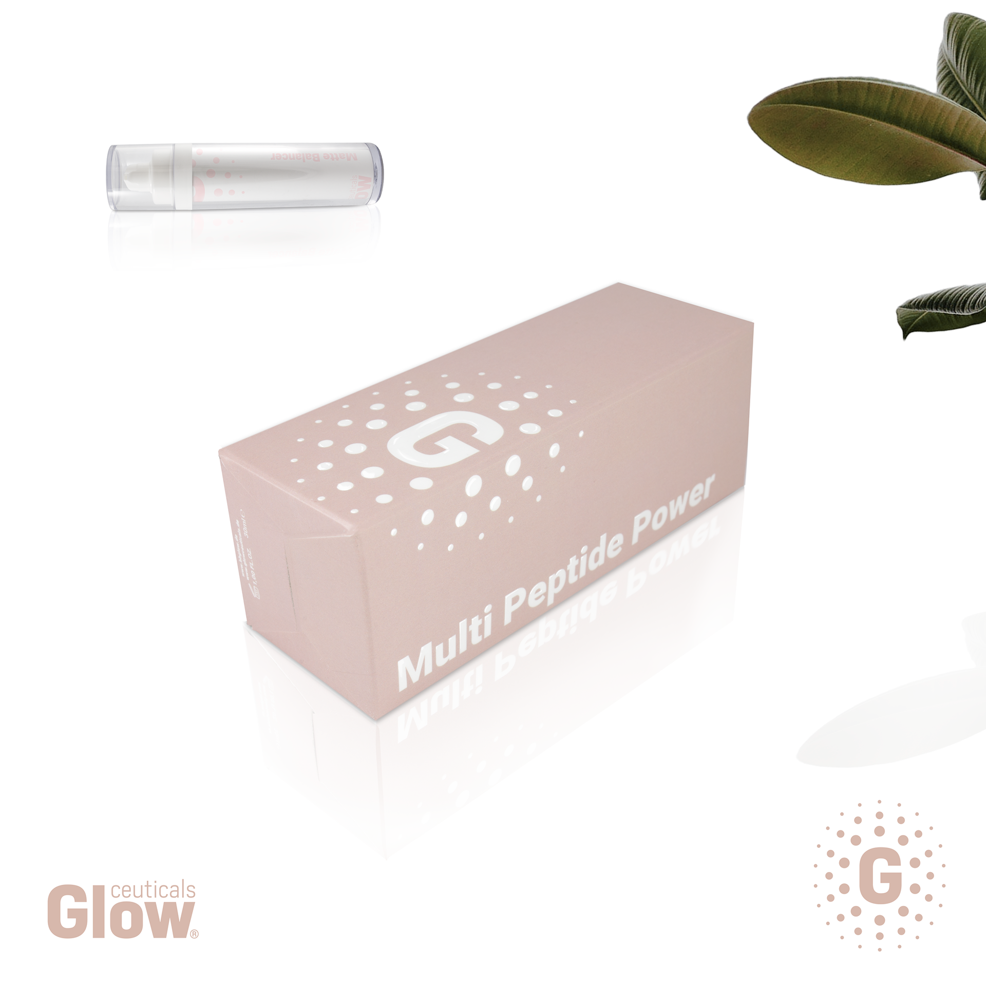
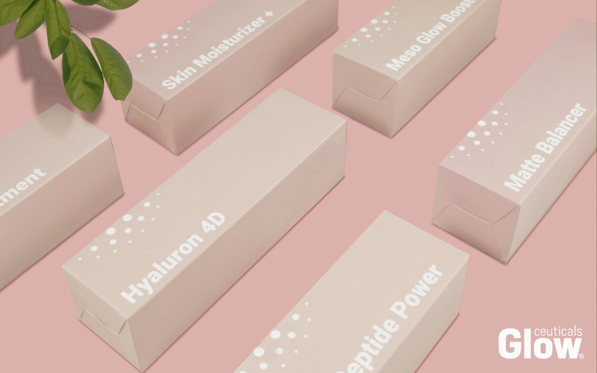
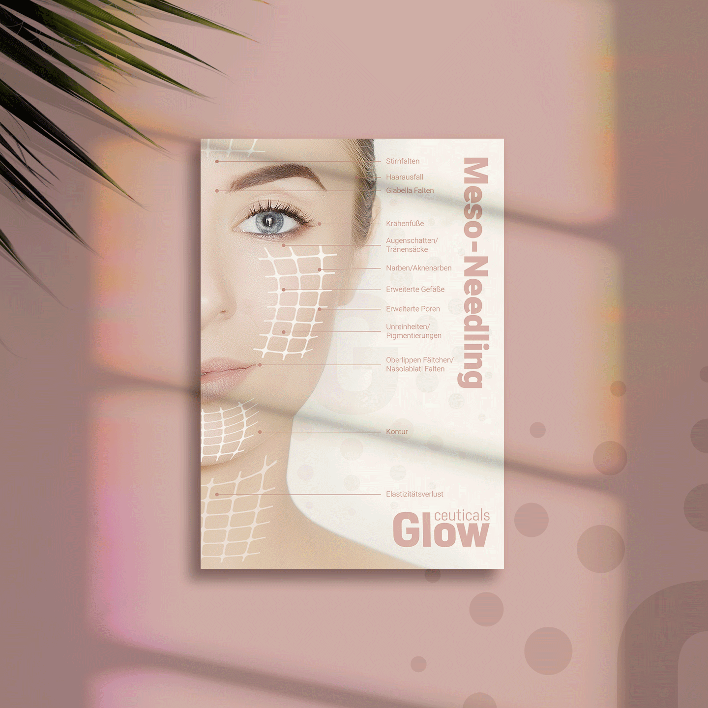
After
The Journey
At the start of our expedition, we explored the German beauty market and global industry trends. We learned about local competitors and consumer habits and talked with Glowceuticals’ partners and clients. We even checked the closed Facebook groups of German beauticians. Our thorough analysis led to some strategic recommendations for the brand to follow:
• speak to the ordinary women, but stay relevant to professionals;
• maintain the expert reputation by sharing know-how and experience;
• invest in activities that support the professional community;
• earn consumers’ trust by showing the brand’s human face - make the founder visible;
• effectively use the partners’ network online to grow the brand’s credibility.
Identifying the key client segments of professionals and end-users allowed the team to modify their marketing activities in the long term. Most importantly, the segmentation gave them the confidence to know who they are talking to and how to provide value.
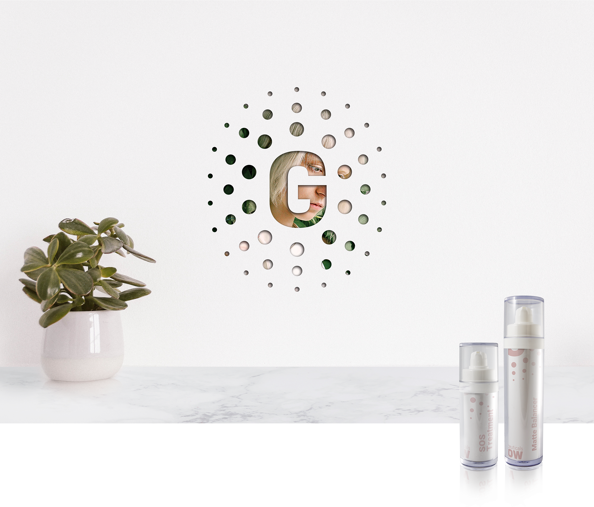
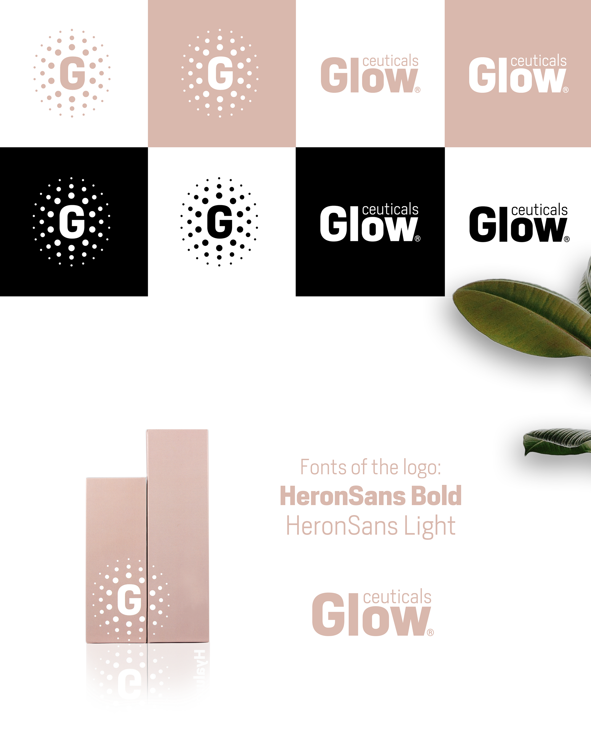
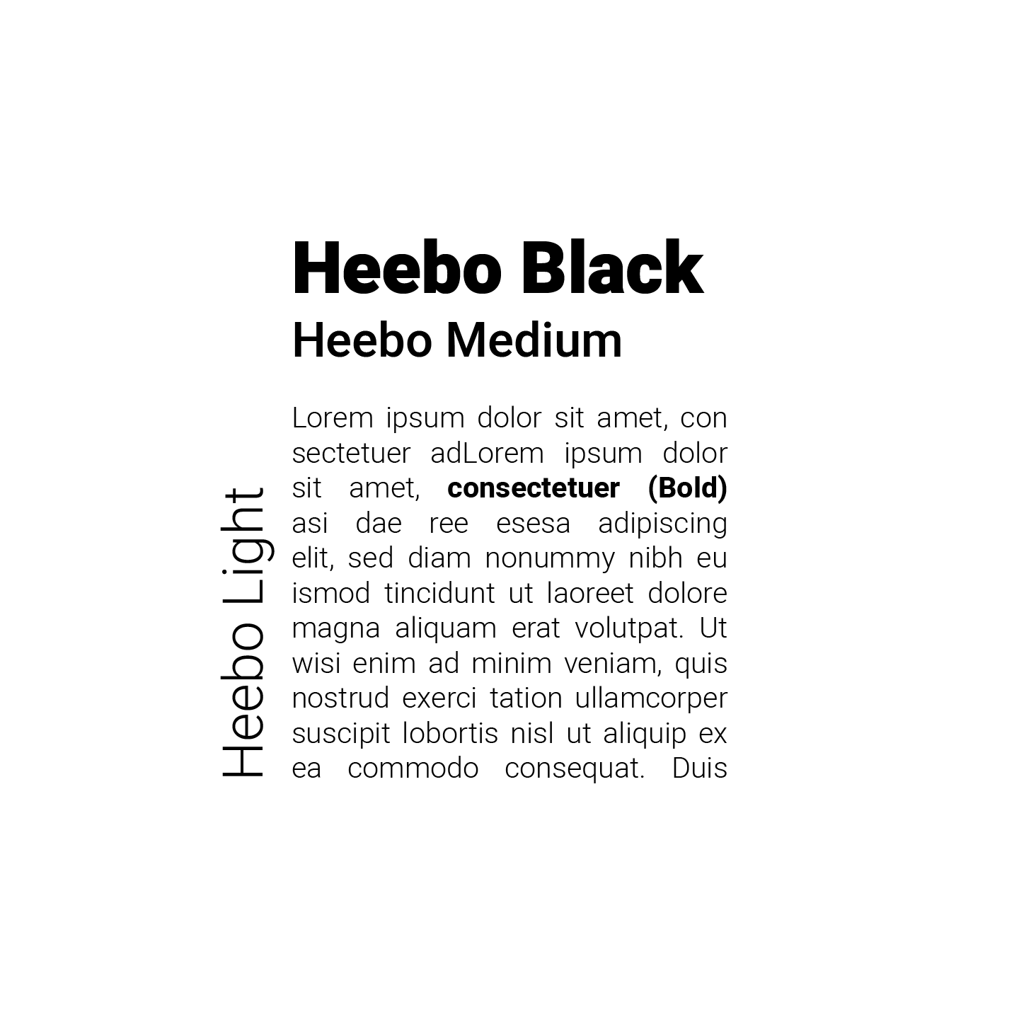
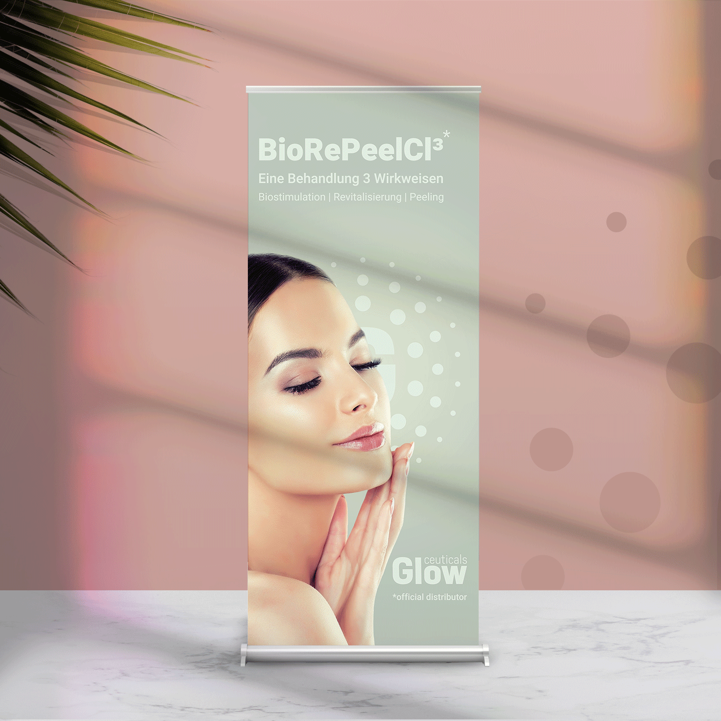
Distilling what makes the brand different and what moves it forward was also teamwork. The brand had to convey trust, quality and expertise. That’s why we chose a masculine font (Heron Sans) to instill a sense of safety.
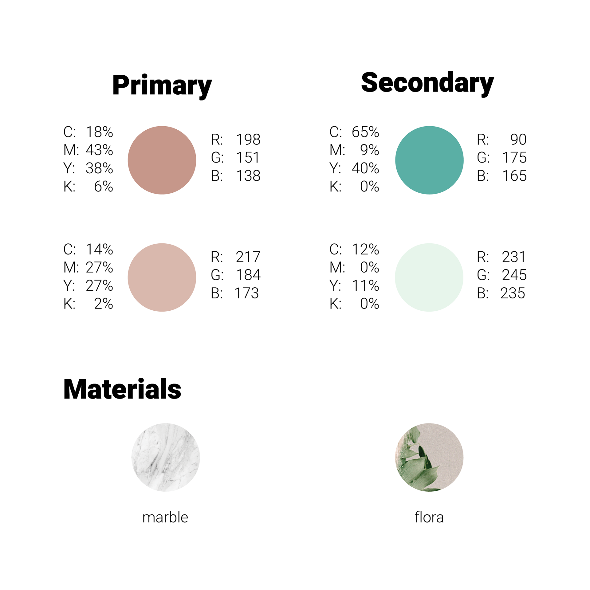
Adding gentle colors and natural elements softened the overall impression. The logo itself depicted the feminine glow that comes from within.We used plenty of white space to get a clean minimalist feeling, but avoided looking too sterile with floral motives and human presence. We selected confident, natural women, who obviously felt good in their skin.
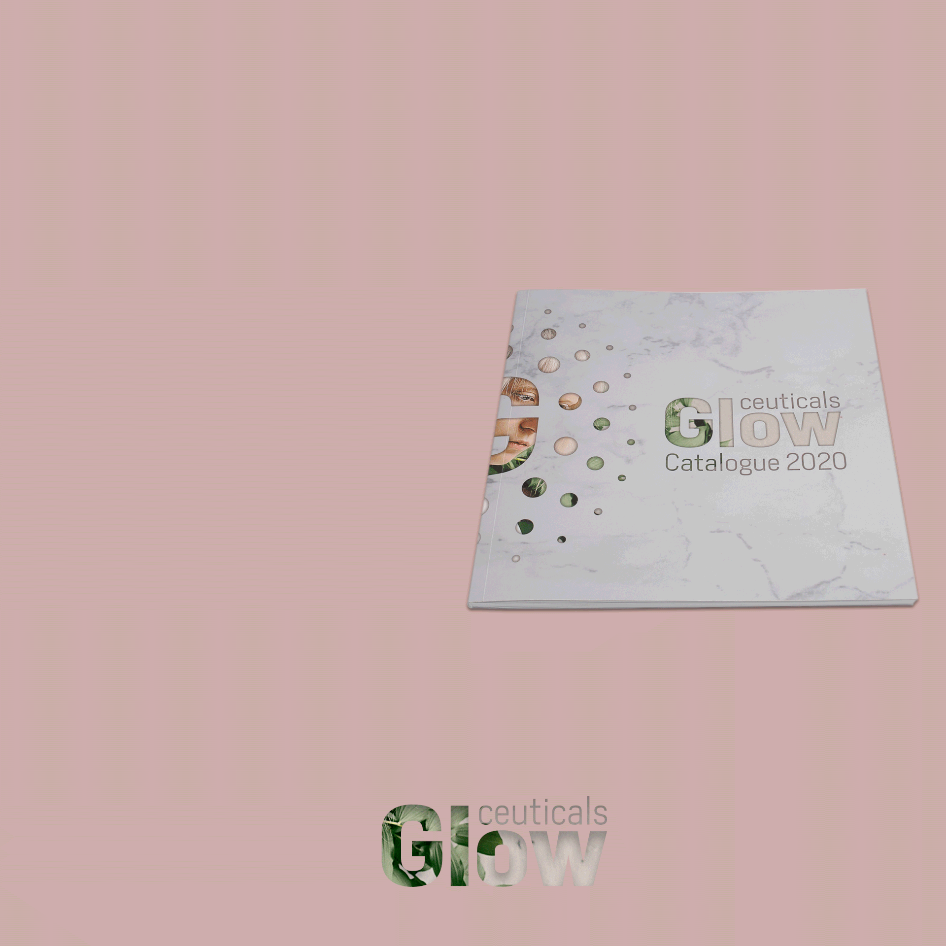
We gathered Glowceuticals’ values and principles in a brandbook and transferred the brand mantra across the network. With guidelines for the visual language, tone of voice, content tips and key messages, communication consistency and engagement improved dramatically
The Resolution
The time for major rebranding came with the launch of Glowceuticals’ new product line. We produced new packaging, replaced all printed materials across Germany and upped the game on social media. In the months to follow, online communication engaged followers with valuable, informative and emotionally appealing content, served directly by the founder.


We had the rare opportunity to develop this project from scratch and to change an established brand from the core. We are grateful for the vote of confidence!