
When creating a brand’s visual identity, we try our best to stay away from cliches. It’s easy to grab onto the most obvious association and turn it into a symbol. That’s how you get a generic logo, no different than others in the category.
We never forget Chermayeff & Geismar & Haviv’s mantra that a logo should be:
| simple
| memorable
| distinctive
That is why, we sketch our most obvious ideas and quickly get rid of them to find a deeper interpretation that fits the brand’s positioning.
We know a logo is not an identity, so we put in the work to create a complete visual language. The colours, shapes and fonts add layers of meaning to the logo and impact viewers instantly and subconsciously.
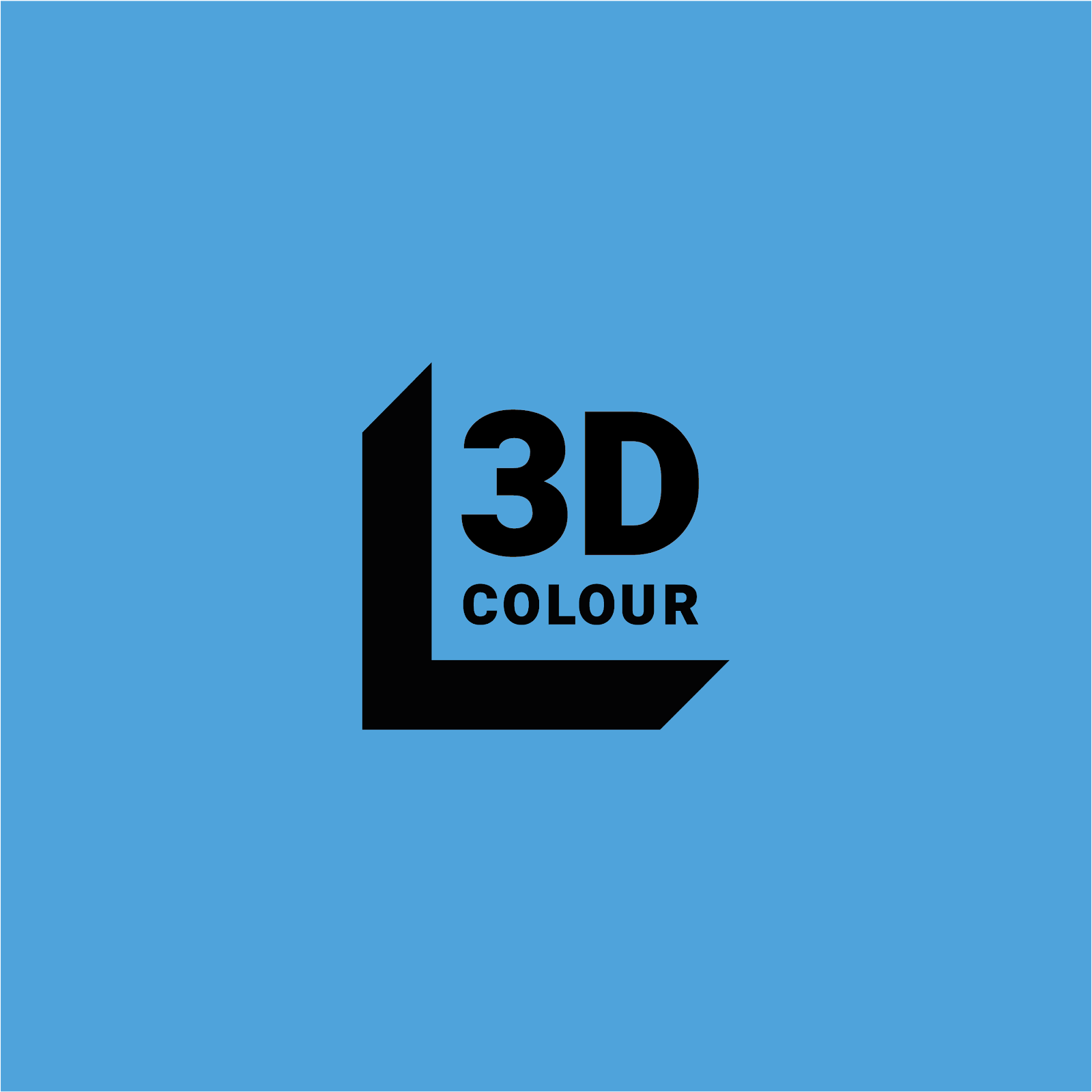
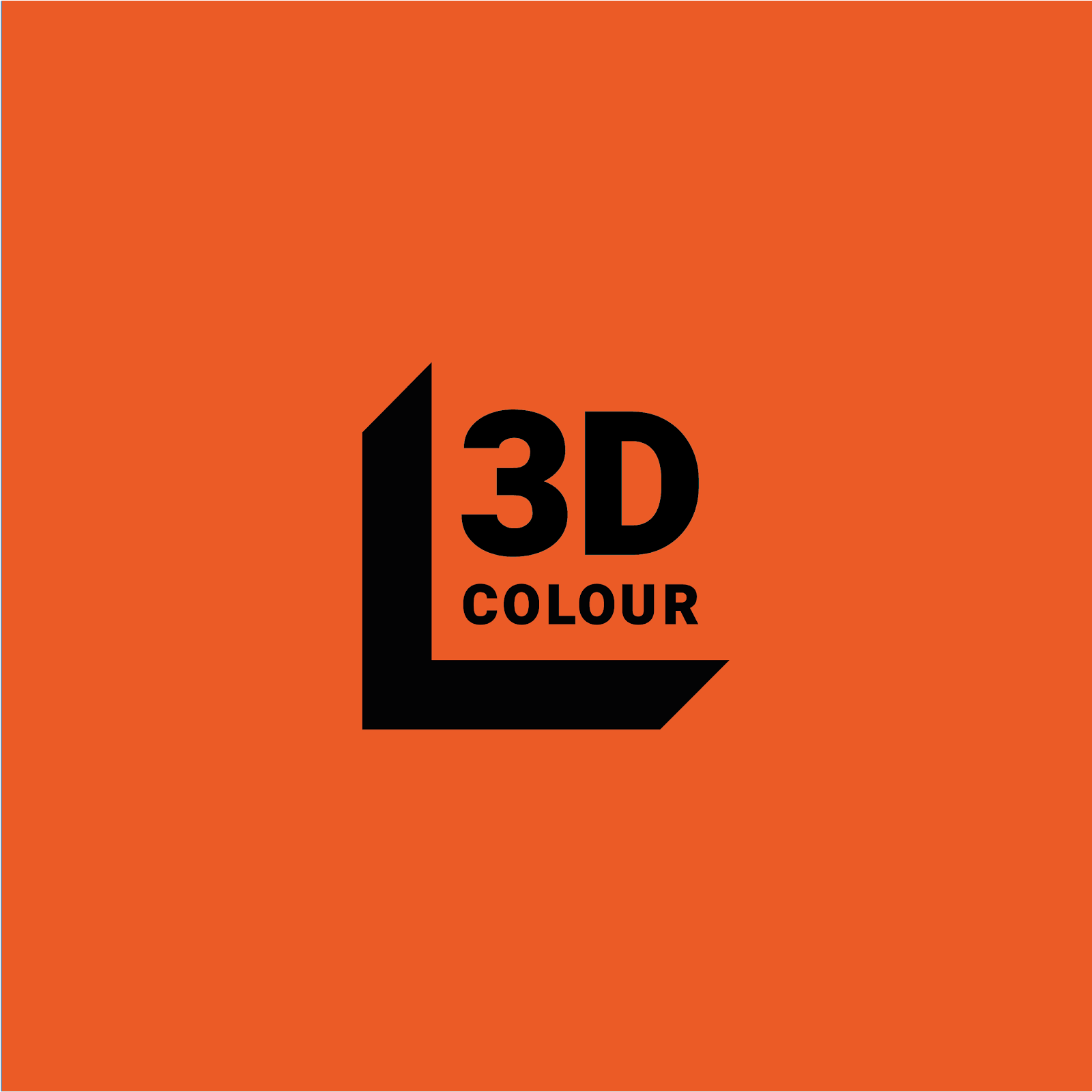

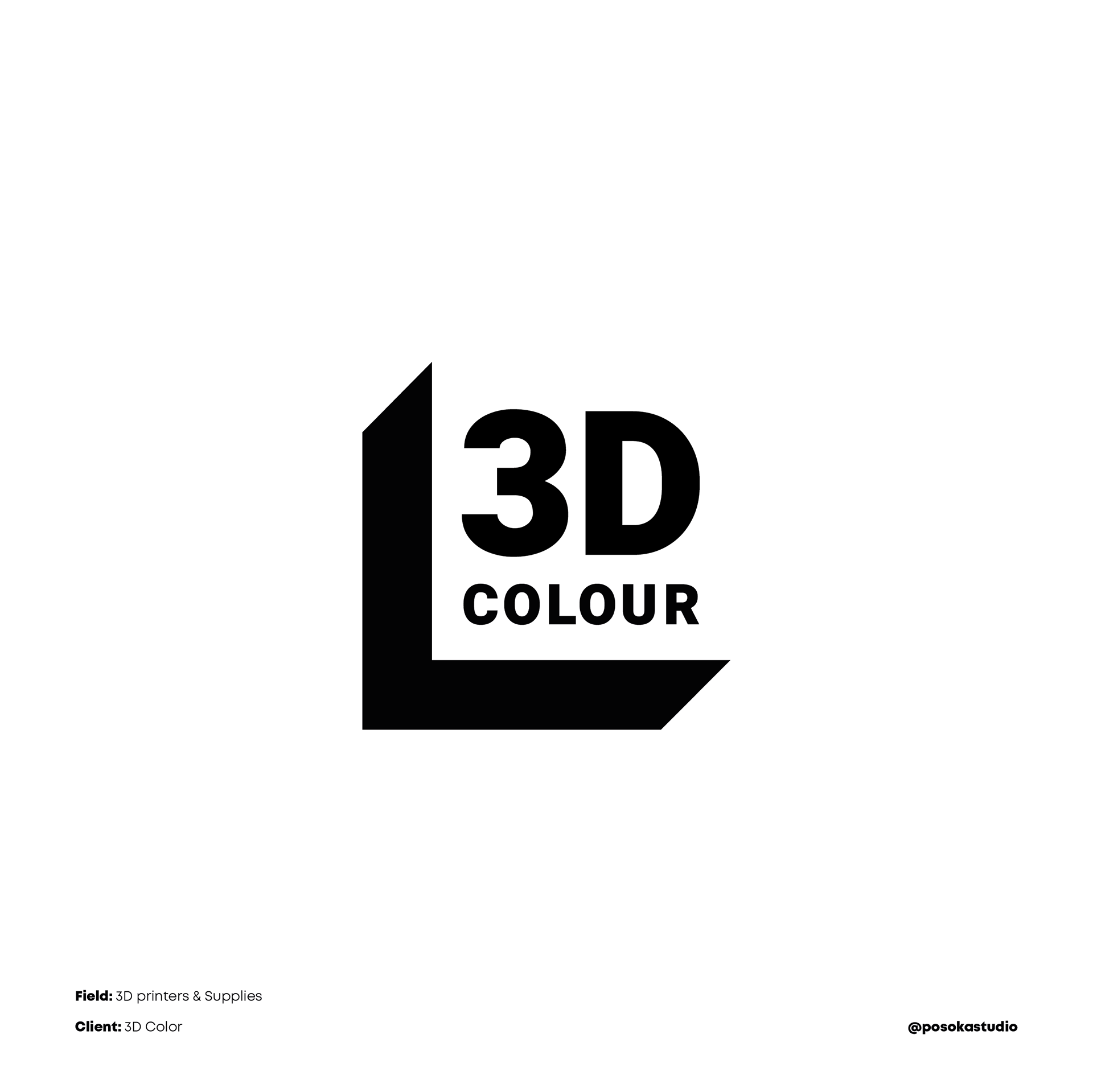
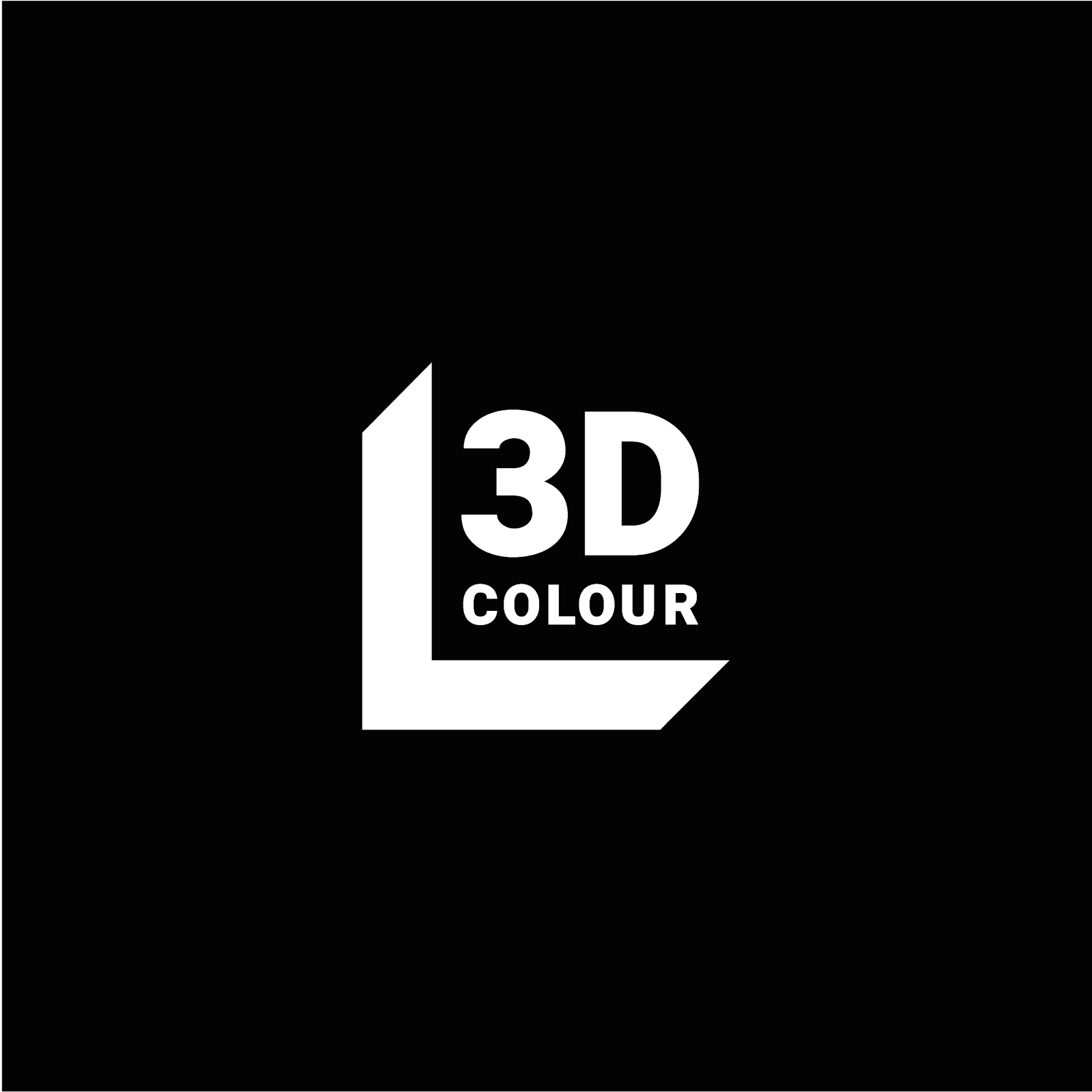
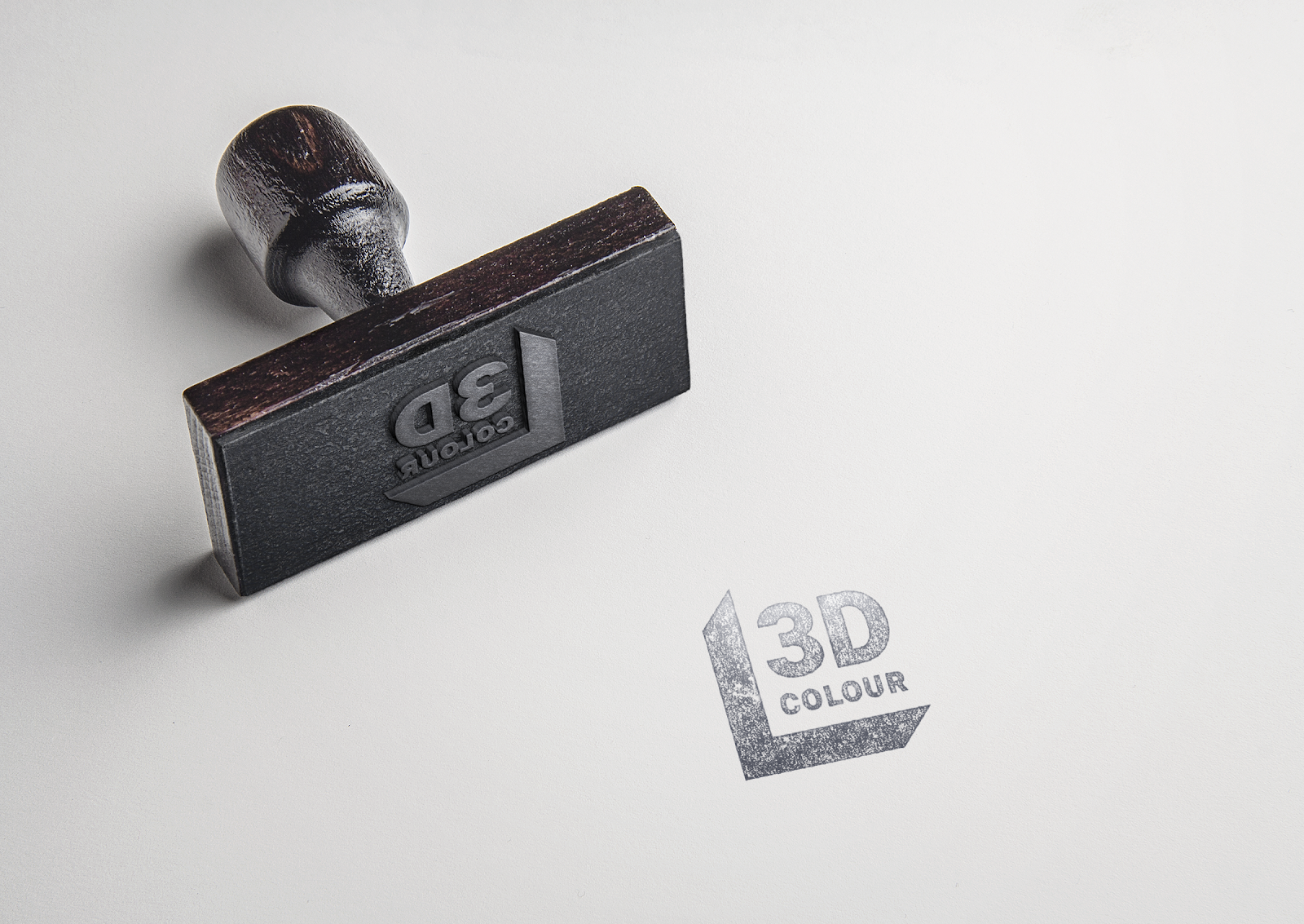
With 3D Colour, a company selling 3D printing supplies аnd equipment, we had the task to update the logo and create a visual identity that will modernize the brand. The rebranding had to appeal to both professional and hobby customers, emphasizing the company’s drive for innovation, professionalism and originality.
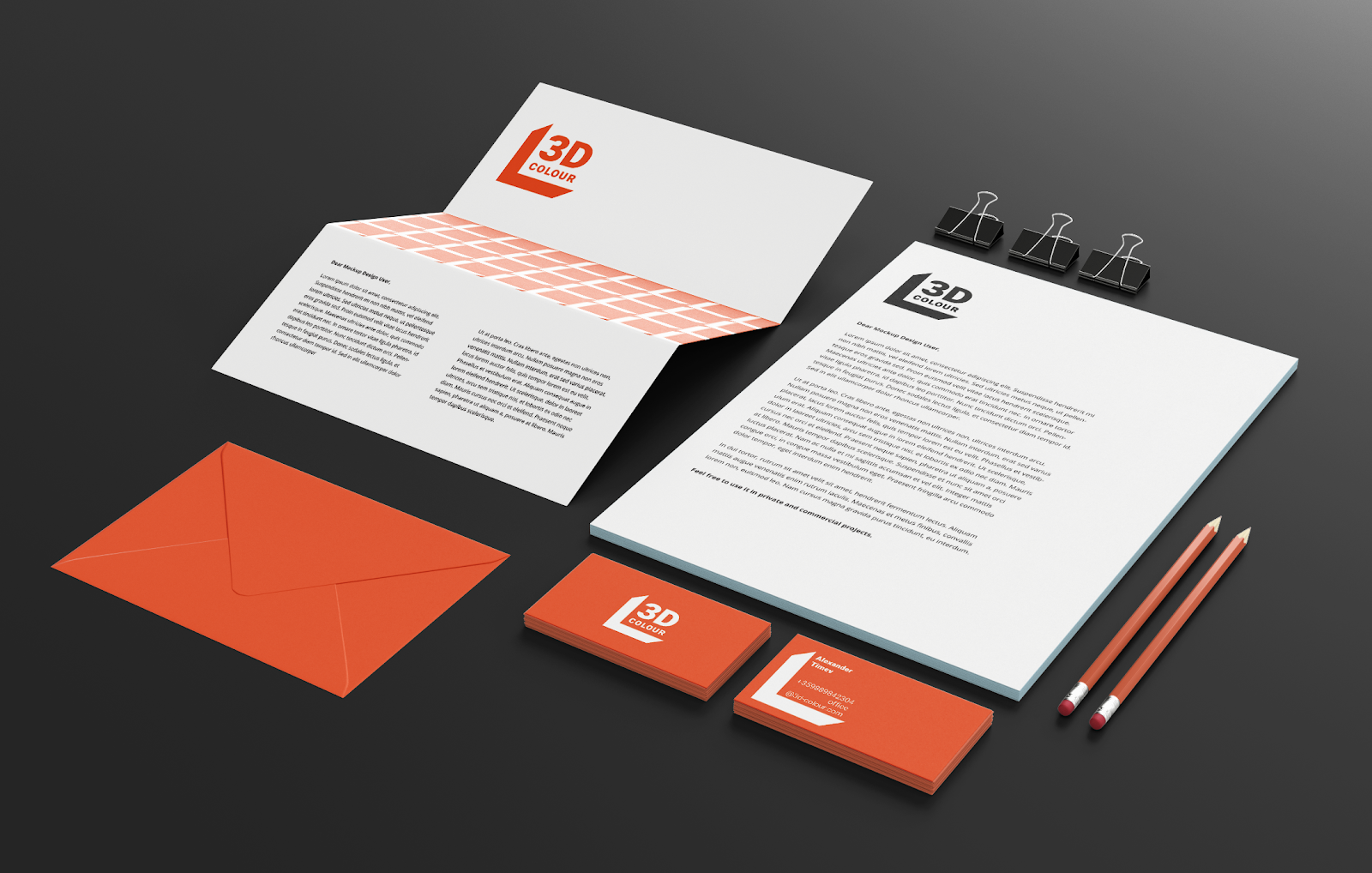
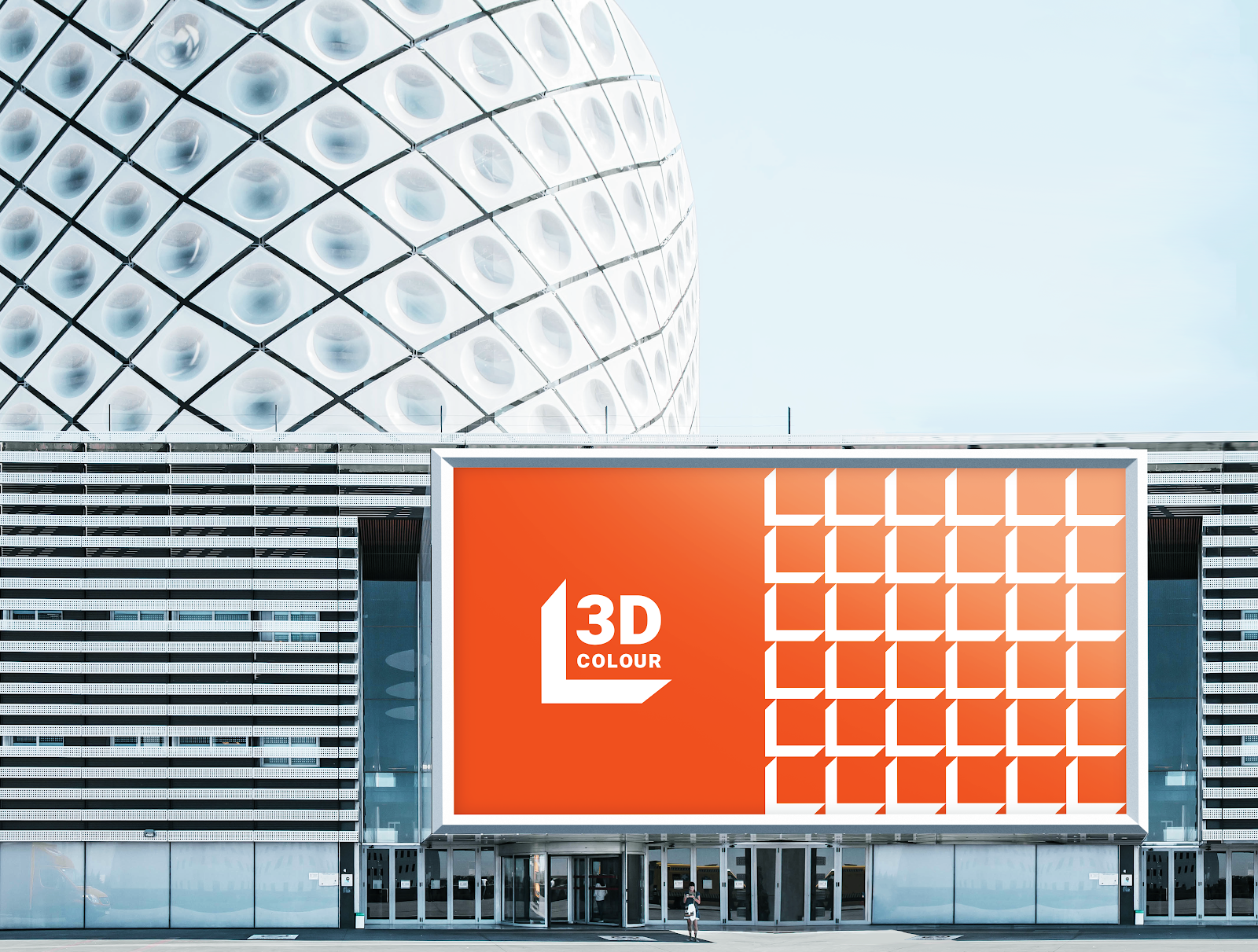
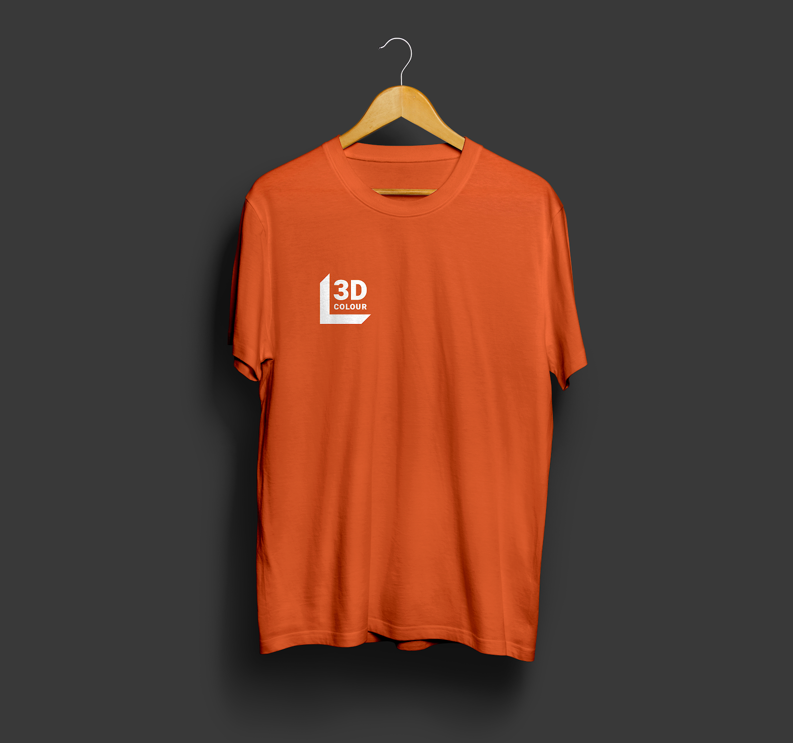
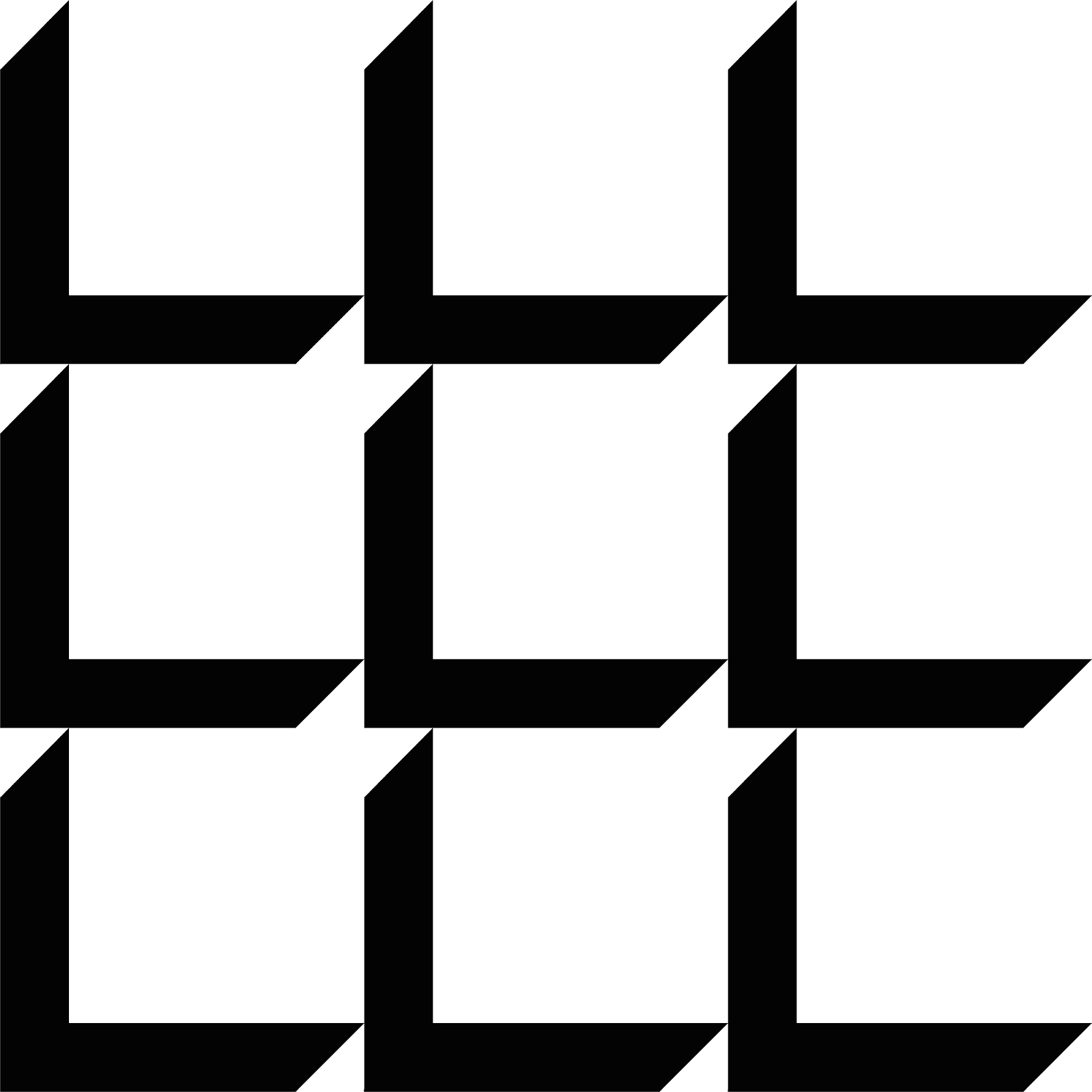
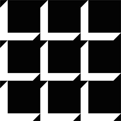
In an attempt to move away from the most commonly used symbols for 3D printing, we chose to display a 3-dimensional object in 2D - a creative solution that stood out, but still linked directly to what the company does. We chose bold orange as the primary color to express the positive, curious and forward-thinking nature of the brand.
Thank you!